After a reasonably early wake-up, toast and tea for breakfast we headed out to see some work by Antoni Gaudi, the legendary architect who called Barcelona home. I tried not to research the trip to his basilica, because I did not want to go with any pre-formed ideas. When I was growing up, the term “gaudy” was used in a rather derogatory way to describe something that was over decorated, a bit “OTT”. I am not sure if it was a slur aimed at Gaudi or not.
We took the morning rush hour Metro to Sagrada Familia, and right out of the station the most astonishing organic pinnacled building rises before you, unlike anything you have seen before (perhaps echoing ancient Cambodian tower silhouettes). From a distance you see the spires in outline but as you get closer you realise that the main entry approach currently (The Nativity Facade) is an astonishing collection of symbolism and imagery that attempts to explain the whole nativity section of the Bible. Every surface contains details, groups of people, animals and plants, so difficult to take in from any one angle.
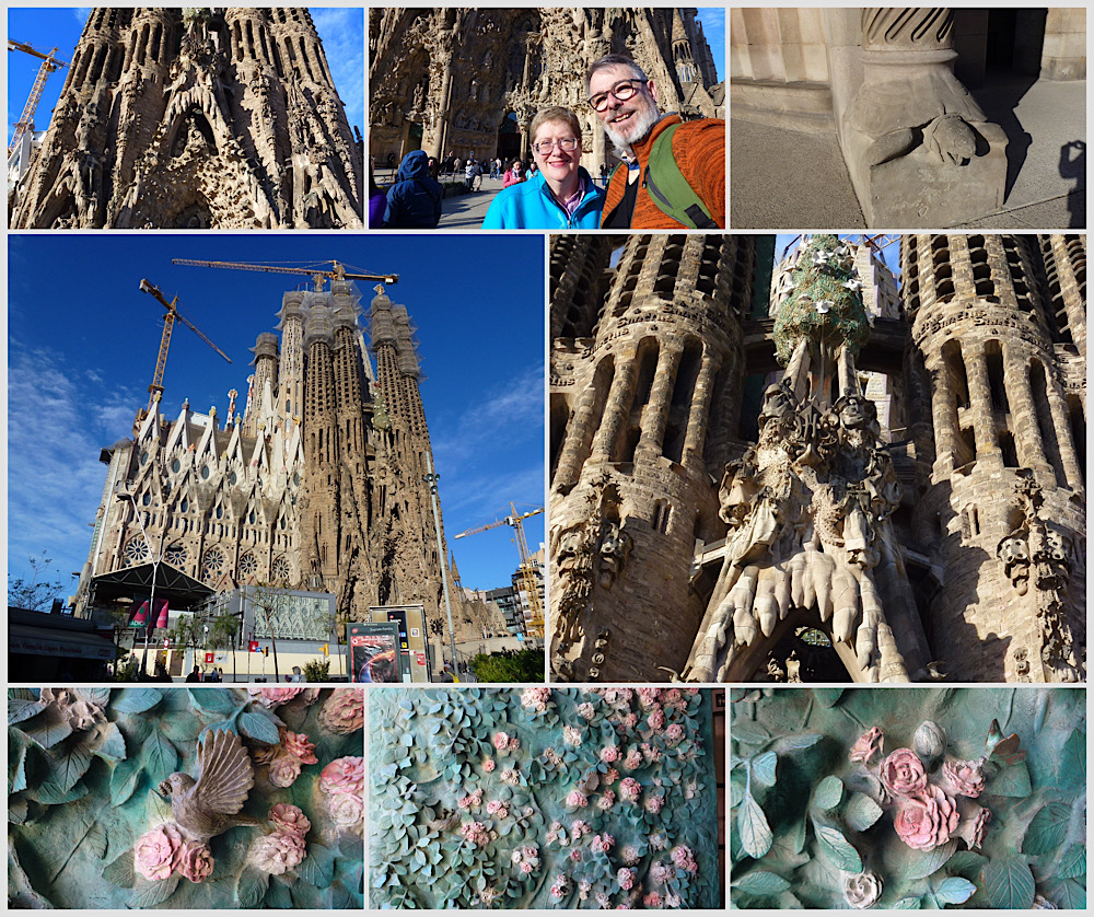
Like most attractions in Europe these days, check in required bag X-rays. We had a timed entry, and Jo had booked for a guided tour a little later, that gave us a chance to look around one side and some time inside before the tour began. We had advice that either the early morning or late afternoon sun was the best time to be inside Sagrada Familia (The Holy Family), and it was obvious why. Morning sun streamed through the east facing lead light walls, flooding the insides with washes of the most exquisite subtlety and variety.
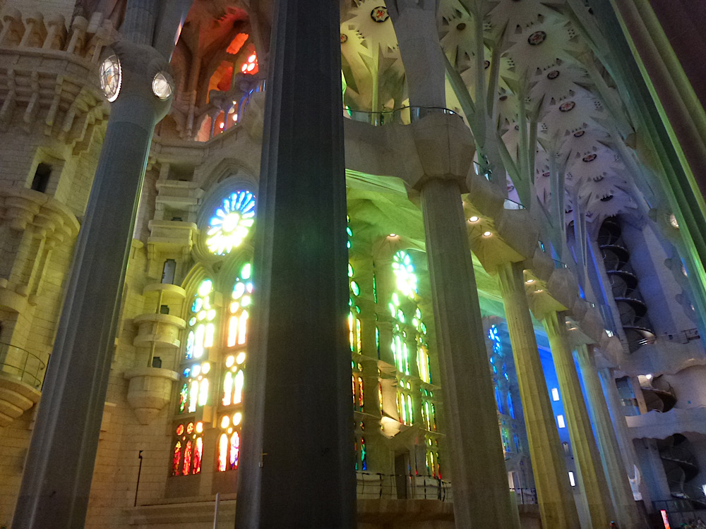
The inside is a forest of buttress free morphing columns, that start as one shape in cross section, and change the higher they go. They sort of twist on themselves in high tensile ways to be strong enough to hold up arches and ceiling details. Modelled to resemble a forest, high in the air was a layered canopy roof, galleries and skylights letting floods of natural light fill the space.
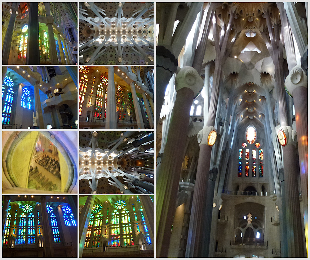
East and west walls of the basilica both are lead light, really modern patterns with strong colours themed around winter-spring and summer-autumn. The tone palette dances all day – Gaudi decided natural light would make his basilica the brightest in Europe and I can only agree. The inside is fairly plain, no frescoes, not paintings, just a few statues, a plain altar – the light baths provide the decoration. What inspired design, and what innovation to have such a huge space without being cluttered by buttresses and supports. The ceiling seems to float.
We started our guided tour (or everything you wanted to know about the bible and gaudi’s interpretation of it) which explained details of the Nativity Facade, we then crossed the church to the other outside, noticing a distinct art style change – brutal images adorned the Passion Facade (the western side).
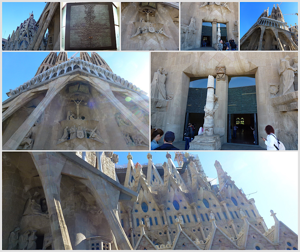
We had it explained that the church is still being actively built, in modules offsite and being assembled here, clever. The final facade – “The Glory Facade”, designed to be the main entrance (the southern end) has yet to be started. The main impediments being funds and land. There is a large residential block in the way. This is the church, not government, so they have to wait to be able to acquire the land before they can complete it.
The guided tour was really interesting, and it just made me admire Gaudi’s conviction and passion all the more – this was his life’s work – even though he did not live to see much of it built. We wandered after the tour, found the Sacristy and a view of the crypt (the working church inside the church in a huge vault beneath, and the final resting place of Gaudi, who dies of complications after being hit by a street car).
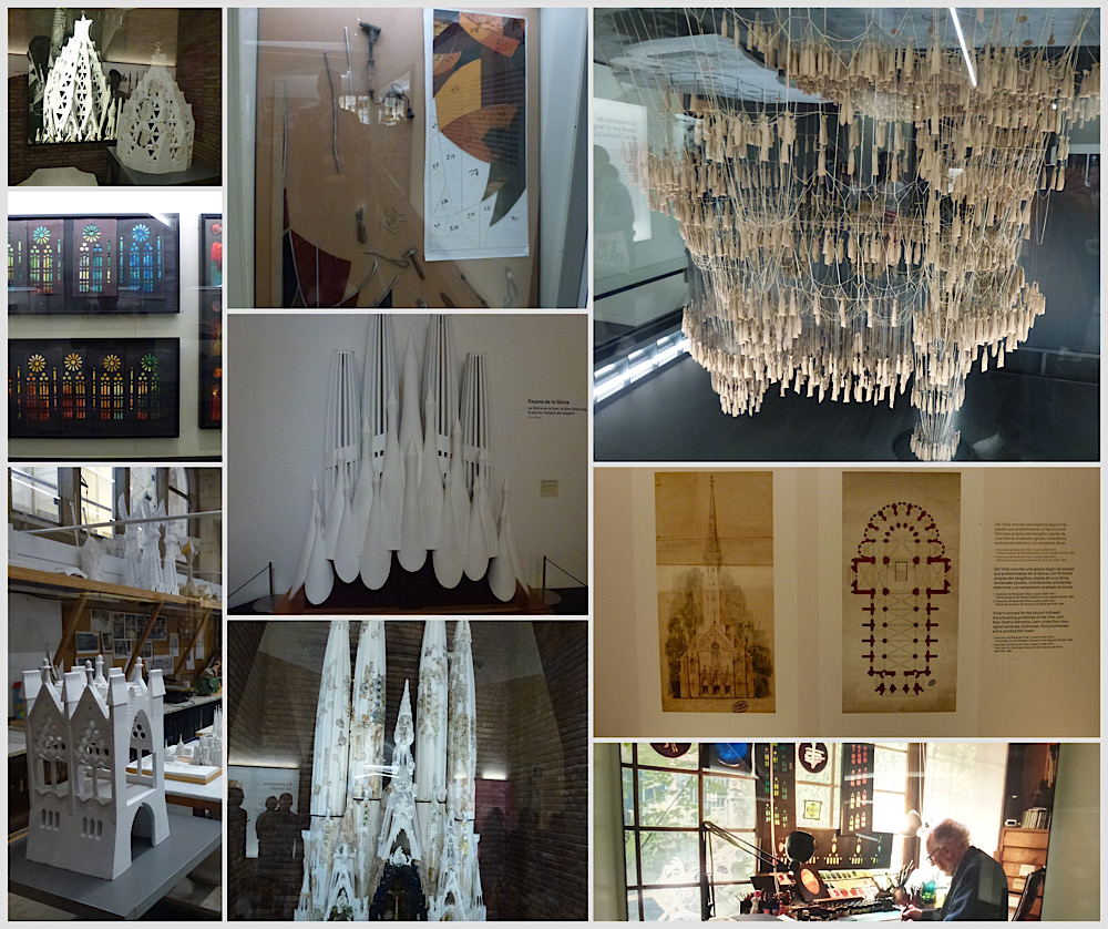
Underneath the main basilica, there is a labyrinth-like museum that had Jo and I wondering where the space for it came from – a lot like TARDIS engineering, it was inexplicably much bigger on the inside. The museum chronicled original (unremarkable) plans for a Gothic style basilica, for which the foundations had already been laid. Thankfully the architect of that forgettable design left the project after a year and a young Antoni Gaudi was given the task of building it. His approach – change everything, do something no one had ever thought possible and work out how it was possible to support towers and a roof without buttressing. Genius. The museum displayed models of early mock-ups, 3D stress test models (before architects were using them) and early versions of decorations, methodology for designing the lead light walls, so much to be interested in.
I am still blown away by this building. I took flat and 360 photos of it and it is only the 360 photos that even come close to describing the majesty of the space Gaudi created.
We then headed for Casa Batlló for photos, noting the Gaudi designed lamp posts along the way. We then (by this time our feet and knees hated us) walked to Casa Milà as we had a timed entry to view the inside of his apartment block.
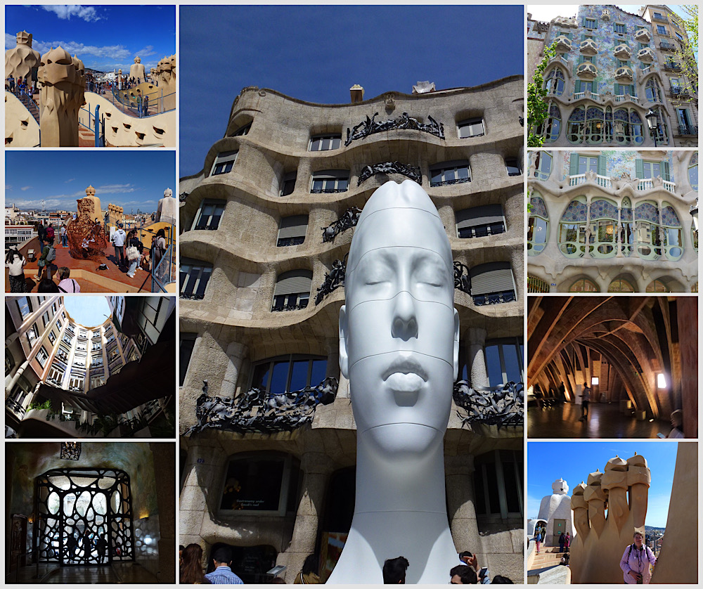
After a wait (chance to rest), we were granted entry and a free audio guide, then pointed in the direction of the stairs up. 6 flights (!!!!!) later we arrived at the display apartment level only to be told we -could- have taken the lift (if anyone had suggested it) – grrrr. We walked through a spacious and really modern feeling apartment, lovely curved lines, open plan, so light and airy. You really got a sense of what it was like to live there, particularly they way they had it furnished and explained.
We then headed into the roof space, an “attic”, but in Gaudi’s hands it was like being in the belly of a whale, with dramatic ribbed vaulted ceilings in curves that were all different (and must have been infuriating to build).
From the attic we went up another spiral staircase and emerged on the craziest undulating, sculpture adorned roof. Groups of chimney-like figures were speaking Spanish poetry, sculptures and services all artistically rendered in lime wash or clad with broken crockery – just wild.
Amazed and exhausted, we were shepherded to the elevator for the journey back to ground level. We then hotfooted it to a Metro station and home to put our feet up after another epic day.
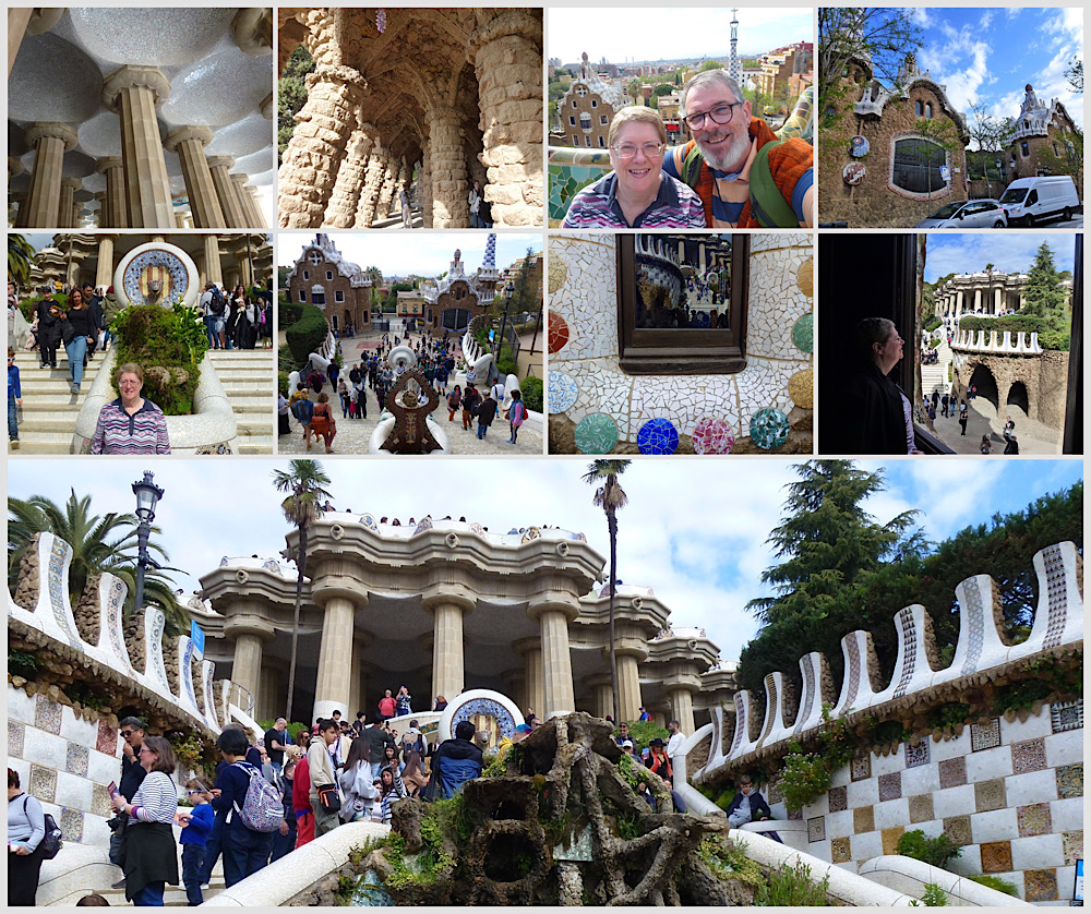
A few days later we did have a final Gaudi excursion to “Parc Guell”, in the outskirts of Barcelona, a sprawling parkland, designed by Gaudi. We found large sections closed off, and a confusing map, but managed to see many obvious Gaudi touches, and had we been less burnt out (and having younger legs) we would have explored it fully, but some of the more mountainous areas were outside our level of puff for the day.
Based on what I have seen of Antoni Gaudi’s designs, it is clear that he was an artistic genius, innovative architect and inventive engineer, decades ahead of others in terms of what was possible in building design and structural engineering. So glad we had the opportunity to explore some of his work up close and personal.

