PRATTLER - for people with somethign to say

User (or Loser) Interface Planning

So, how do we go about desiging CSS that will cleverly encapsulate these features?
We can EXPLORE some coding now


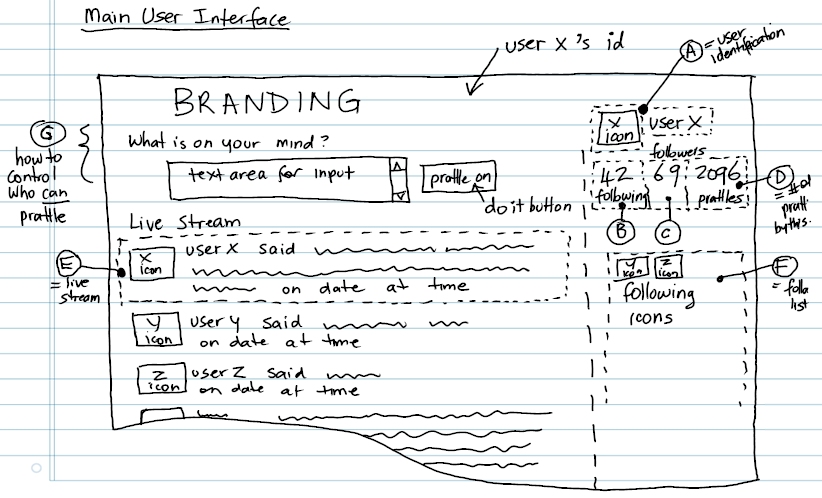
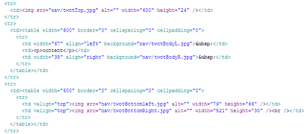
...now this is my proposed FEED cell (broken apart deliberately to reveal its structure) - cunningly designed using a sequence of nested TABLEs - now I know, because I have been told that tables are bad ... mmmkay? So - how do I achieve this layout (with an expandible middle thingy, using CSS and DIVs?

The left and right edgy bits have imgs as their BACKGROUND so they tile as they expand, making it look sorta seamless, the doohicky at the bottom has room for icon, who and when the prattler prattled ... I like this layout - from an accessibility perspective is it ok?

On another tangent - WHY would I be interested in exploring an alternative to a table?


[prat icon] [pratname] said this on [prattledate]
...because icons make it betterer

The existing HTML for this section (the container table is 600px wide) is something like this:

code for feed


Regarding PLATFORM

What platforms and browsers should we build for? Should it matter? Why?


wonkoasked by wonko on 24 sep 2009
 

Screen Size

What screen resolutions should we assume, or should it all scale seamlessly? How do we cater for MOBILE access (with limited screen real estate)?


wonkoalso asked by wonko on 24 sep 2009
 

Accessibility

Should there be a "text only" or "screen-reader friendly" version (or indeed should the standard version be good enough for this purpose?) or a "print" version or is that not necessary? Is the contrast good enough for sight-impaired users or should there be a "high contrast" version for them?


wonkoalso asked by wonko on 24 sep 2009

User Interface