Old school …
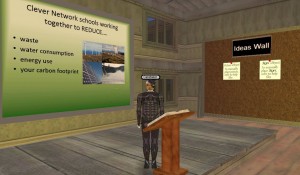
…so I am building this old style school building, right, and it is supposed to showcase all that is wrong with a non-eco-friendly establishment. So I have leaking plumbing, over flowing rubbish bins (oh, remind me to make an incinerator), blazing incandescent bulbs, inefficient aircon and so on, and some classrooms and collaborative spaces to discover and explore related issues.
Yee gods it is interesting how the design emerges from the components.
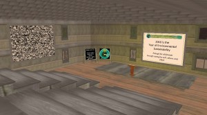
I have a two-story building and decided that one of the wings lent itself to a lecture theater (timber bleachers, bible-bashing lectern and display surfaces) and so set about kitting it out. From a purely practical perspective I am really happy with the results.
I get a presentation area, break out zone as a mezzanine above and an entrance foyer that we can use to showcase topic, speaker, resources etc. Some interesting level changes, some useful nooks and crannies and, strangely, it is just like I imagined it.
This building is teaching me all sorts of things about builds that I think I had to learn for myself. Ceilings are not the same as floors – we use “flats” to achieve both, but most flats are one sided (oddly, they have a texture on one side and appear not to be there on the other so you have to upend them to do the other job. I have a building with plenums or “ceiling cavities” when laminating a floor above with it’s ceiling below – if this makes sense, and this lets me consider other modular building techniques – each flat has scale that fit with wall pieces, so you can tile seamlessly and create quite elaborate floor plans fairly quickly with only micro adjustments (and occasional stretching) to hide the seams. Doorways and ends of walls look better if they finish in a thicker beam (as zero width walls when you look at them edge on are just plain odd), irregular geometry is a pain, and requires careful planning. Some wall sections control the tiling of textures so, although you can select a texture to match another section, the two may be tiles differently causing frustrating differences in appearance. This is really different to worlds like SecondLife where you have absolute control of texture tiling and just a lot more than frustrating to be honest.
I must be getting tetchy, but I cannot leave stuff that does not look “quite right”, so will tweak and upload variations of objects and textures so they look right – I guess it is quality control (and not just being anal), but I think the quality of the final build is worth the extra effort.

