In the “zone” and feeling moody
One issue with a “world” is the global settings – particularly lighting. Now if you are outside, this is fine, you would consistently want the sun/moon in the one place [although a multi-sun world might represent a challenge still]. The ambient light [that which generally soaks everything non-directionally and the directional light that originates from the major light source [the sun] as a global setting lets you pick intensity, angle and colour. These effect objects differently using the SUBTRACTIVE colour model – let me explain.
We see objects in the real world as a particular colour because the surface of those objects are reflecting THAT colour light into our eyes. A red shirt looks red in white light because white light contains some red – the shirt absorbs all but the red which it reflects and we see it – got it? In-world objects have colour schemes also – if the grass, for example is to be seen as green, then there must be some green in the directional or ambient light, else it will not appear green. Lighting in a virtual world [activeworld and secondlife] model this same system so some interesting moods can be created and commonly recognised objects can take on new qualities if illuminated using different colours to those it would naturally appear under white light.
… however
If you create a chamber, with a roof and solid walls, say, the world light settings seep through and plainly illuminate the inside space just like it is doing the outside – this is weird to say the least.
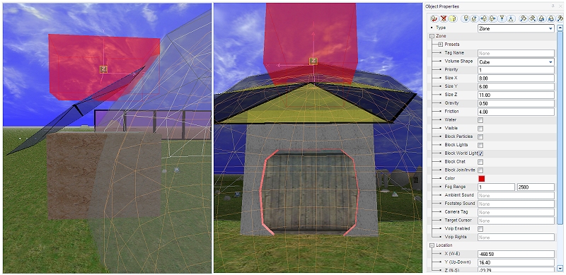
Activeworlds combat this issue by allowing you to create zone objects [rectangular prism, cylindrical and spherical] that let you apply local settings. In the above illustration, I have created and sized “red zone” to fit inside my airlock [but have yet to lower it in place]. Its ambient and direction lighting gives the user a feeling of being de-contaminated – red and dangerous looking. I also changed the local friction and gravity in this zone so it behaves like it is viscous to travel through. Similarly, inside the dome, I made a large spherical zone that filters outside light and lets my local lighting do the job it was placed to do.
So what? Zones will be very useful – we can make “holes” through our landscape but the global water table is just below the surface which by default means all stuff below that is full of water. To make a subterranean [or indeed a submarine or some breathable space below surface] you surround it in a zone that excludes the water and presto. Zones will let us make detailed and moody interiors as well which will greatly add to the sense of space.
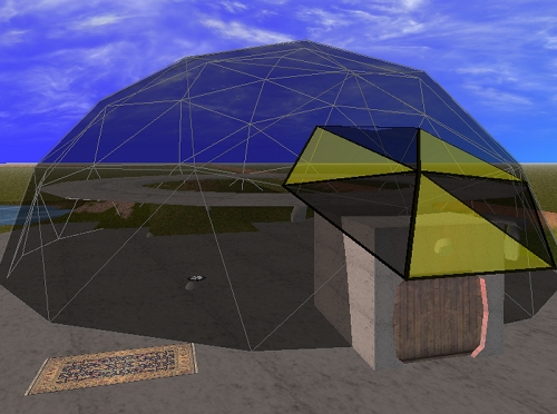
With a simple concrete “plinth” in place, the dome looks a lot more like it belongs there [a narrow collar would also help from an engineering perspective given the inside struts etc – the beauty of a virtual world however is that the rules of building are not restricted by the forces of gravity or tightly bound to the laws for physics, popular culture or bad taste so we can get a little liberal with the building regulations depending on the culture we are depicting. I floated a second floor donut [well, technically it is a torus, but it is near lunchtime so donut is fine] as a circular viewing gallery – I will re-wire the lift to take you up and down I think and it might be useful practise plotting waypoints.
I added some programmed light sources to see if I could [I wonder how often exploration is justified for “shits and giggles”] and we start to get a feeling for the place. Above the the outside airlock there is a red light – when you activate the door, the door tells the light to go green [to indicate all is ok to enter]. When you travel beyond the threshold of the door it closes and changes the light back to red. I will leave my magic carpet parked outside, but might see if I can find a Dalek exoskeleton to travel around in [I am a geek if nothing else 😛 ].

