Showcase…
So I have begun dividing up the bunker space, and decided we needed display cases for the two current exhibits (sorry, i see the bunker as more of a museum, with other venues handling most of the hands-on activities.
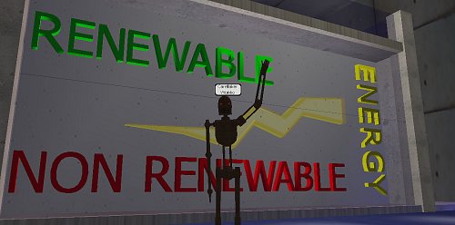
Having already made a “bright spark”, it seemed natural to use as a symbol of the energy sources wing, so built a box, places some letters, and a couple of layers of spark – made one a lightsource, flickering like sparks of white, faced it with glass and …
…we have an energy showcase. It has some depth, so we can put other things in there also, is backed so it is separate from the display space behind and I think it looks pretty zappy.
I am also using my “rustbot” avatar lately – I like the dis-embodied old but still functional look of that avatar, although my analyst would probably have something to say on that front.
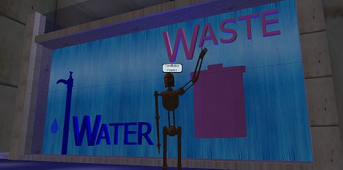
Next to the “water and waste” showcase – a rubbish bin – pink to make it kitsch, a fountain animated texture at the back of the showcase to look like running water – a tap (one I made earlier) and I thought a drip also would look cool:
…so I fired up Wings3D, started with a cylinder, squashed it flat, pulled one edge facet sharp, bluntened the opposite facets slightly, rounded it off, coloured it blue, reduced it’s opacity to 50% and I now have a drip. I animate the drip using a cyclic animation – it leaves the tap, drops through the floor, jumps back to the tap and repeats – looks pretty neat actually. Glass front and we are done, except for a soft, throbbing blue glow of backlight.
Once I was happy, I began showing them off to slow members of the family who did not run away fast enough – she who must be obeyed asked … “how do you get into the lower gallery behind the showcase?” … bugger me, forgot doors.
I sluiced everything away from the existing up staircase, faced the now exposed edges neatly and presto, problem solved – both upper and lower galleries can now be accessed – let the subdivision begin
Walking around this facility, I wonder if Architects have this much fun – imaging a space then making it?
Bright Spark…
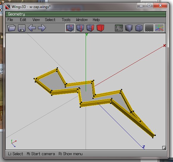
…now the cybernauts are investigating energy at the moment, or more importantly what it is and why that is important. It bridges to types of energy and sustainability and so on. My lagged brain came up with the notion of a “bright spark” as energy-related, so fired up trusty old Wings3D to make one.
I then edited the RWX file exported and changed the RGB lighting, and added a little less OPACITY, meaning by changing a number from 100 to 70, the object rezzes in-world partially transparent, which is sort of cool.
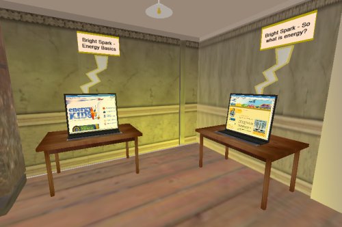
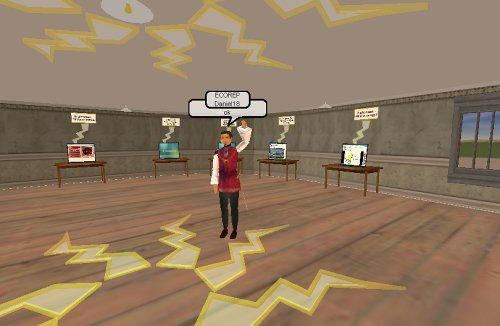
Information stations were then established containing links to websites, learning objects etc:
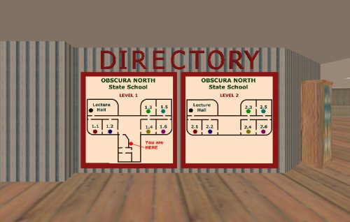
…and a little mood lighting above and it seems to work. I used classrooms 1.1 and 1.2, ground floor.
I have another 4 classrooms on this level to do the investigation into renewable and non-renewable energy. I think the location is ideal – adjacent to the eco-theatre, downstairs from discussion rooms and so on – all in all this building seems to be working out rather nicely.
So with a little decoration (can you see how the zappy things are a little bit see-through? This is the opacity of the model and I am guessing this is much less resource intensive as a way of gaining transparency than masking, which requires an initial surface and another surface modifying it) and the “Bright Spark” gallery is largely ready to go. Tried to add some “contribute your ideas” activities to the “click on stuff to find out about it” else I suspect this activity would have been better done as a web page.
…which brings up an interesting question – does being in the “world” add to the activity, or would a website be just as effective at engaging and immersing? Does this level of immersion matter at the ages our cybernauts are in, or does it provide a new level of distraction for kids who cannot multi-task at the best of times, or even single task at the worst of times?
It’s just a jump to the left …
Navigating insurmountable distances is, naturally enough, a pain. When we have a number of worlds in our universe, then travelling between and betwixt is annoying. There are many solutions, and I suspect we shall see them all (and some I have not yet thought of) emerge as the universe expands and develops.
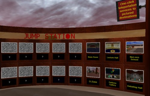
Our first “Jump Station” is conveniently near the initial spawn point on the home world. It provides one-click access to places of interest. I think this approach makes sense, particularly when activities are spread over a wide geographic location.
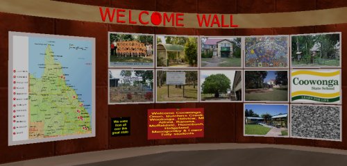
While I was making our jump station, it occurred to me that it might be nice to welcome our groups of cybernauts, so fashioned a “Welcome Wall” as well, after an idea I saw DJ wrestling with.
Some sense that they are expected and welcome was the aim, and given that the punters pull from a wide variety of geographic locations also, it is a good idea to have them know where they sit and a bigger picture of where others are from also – virtual worlds are brilliant for conquering the tyranny of distance (as any dedicated user of synchronous technologies will attest). All set to welcome our first wave of cybernauts it seems.
One of the activities planned is a naming competition:
We ask in-world punters to name our girl, boy and k9 cybernaut companions. Initially I had the notion they would be our Dick, Dora and Nip (or more modernly Sam, Pam and Digger … oops, 2 more copyright laws breached? I claim “fair use”) but think it fitting that the waters be tested with our punters – kids have much better imaginations than us old people anyway.
What do you think we should call our in-world companions? (He asks, knowing nearly no one actually reads this stuff)
Anyway, buildings are being purposed and fitted out with furniture, accessories and most importantly, interactive bits and pieces.
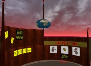
The dome made using the working title “The Blue Room” is now our Gallery Walk.
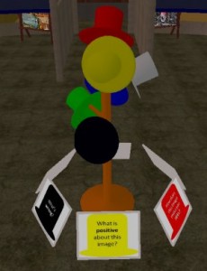
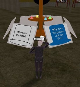
Featured in the Gallery Walk currently is a DeBono Thinking Hats exercise, where cybernauts examine images and then ask themselves things related to the six different ways of thinking about an issue, and respond accordingly. In constructing this zone, I decided to make a hat in 3d (thinking literally here, complete with hat band) and then, when placing them in-world, decided they would best be displayed on a hat stand, which I then also made, after wasting nearly an hour in the object yard looking for anything that might convincingly be purposed as a hat stand. I “think” I can make the hats stick to the head of the punter also – as in they “don” a particular colour hat literally when talking using that point of view – will explore that idea (as a “carry item” mover) as it sounds cute – not sure how easy it will be to place it on the head, if all avatars body geometry is tricky, but will give it a whirl.
The Blue Room seems to fit this exercise really well – it is sectioned off, has a separate area that can be used for display and presentation and has lots of wall space for posting ideas etc. News room to make now … read all about it!
EDIT: in a blindingly obvious (after screwing it up a few dozen times) application of a “pick up item” mover, punters can now WEAR the DeBono hat of their choice whilst adopting that point of view – quite chuffed about that actually.
You attach (or link) the mover to a tagged location on the body (the head, for instance is 4), then tweak the u/d displacement depending on where the origin of the object is, then control the relative displacement front/back, left/right so it sits convincingly on or near the top of the head.
When worn, the hat nicely follows the movement of the head. I chose lighter tones of the 6 colours so they were obvious when worn and made a little shelf to sit them on, adjacent to the posters providing lay-summaries of the 6 ways of looking at something.
… well, I thought it was pretty neat at least.
