Showcase…
So I have begun dividing up the bunker space, and decided we needed display cases for the two current exhibits (sorry, i see the bunker as more of a museum, with other venues handling most of the hands-on activities.
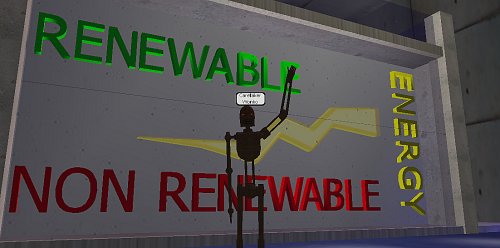
Having already made a “bright spark”, it seemed natural to use as a symbol of the energy sources wing, so built a box, places some letters, and a couple of layers of spark – made one a lightsource, flickering like sparks of white, faced it with glass and …
…we have an energy showcase. It has some depth, so we can put other things in there also, is backed so it is separate from the display space behind and I think it looks pretty zappy.
I am also using my “rustbot” avatar lately – I like the dis-embodied old but still functional look of that avatar, although my analyst would probably have something to say on that front.
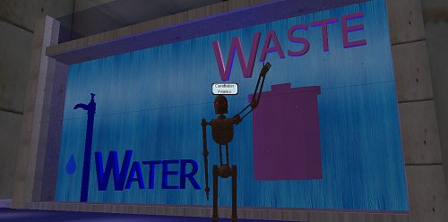
Next to the “water and waste” showcase – a rubbish bin – pink to make it kitsch, a fountain animated texture at the back of the showcase to look like running water – a tap (one I made earlier) and I thought a drip also would look cool:
…so I fired up Wings3D, started with a cylinder, squashed it flat, pulled one edge facet sharp, bluntened the opposite facets slightly, rounded it off, coloured it blue, reduced it’s opacity to 50% and I now have a drip. I animate the drip using a cyclic animation – it leaves the tap, drops through the floor, jumps back to the tap and repeats – looks pretty neat actually. Glass front and we are done, except for a soft, throbbing blue glow of backlight.
Once I was happy, I began showing them off to slow members of the family who did not run away fast enough – she who must be obeyed asked … “how do you get into the lower gallery behind the showcase?” … bugger me, forgot doors.
I sluiced everything away from the existing up staircase, faced the now exposed edges neatly and presto, problem solved – both upper and lower galleries can now be accessed – let the subdivision begin
Walking around this facility, I wonder if Architects have this much fun – imaging a space then making it?
Bright Spark…
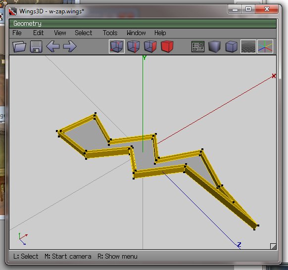
…now the cybernauts are investigating energy at the moment, or more importantly what it is and why that is important. It bridges to types of energy and sustainability and so on. My lagged brain came up with the notion of a “bright spark” as energy-related, so fired up trusty old Wings3D to make one.
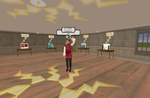
I then edited the RWX file exported and changed the RGB lighting, and added a little less OPACITY, meaning by changing a number from 100 to 70, the object rezzes in-world partially transparent, which is sort of cool.
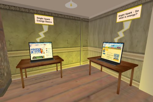
Information stations were then established containing links to websites, learning objects etc:
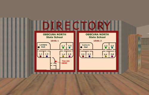
…and a little mood lighting above and it seems to work. I used classrooms 1.1 and 1.2, ground floor.
I have another 4 classrooms on this level to do the investigation into renewable and non-renewable energy. I think the location is ideal – adjacent to the eco-theatre, downstairs from discussion rooms and so on – all in all this building seems to be working out rather nicely.
So with a little decoration (can you see how the zappy things are a little bit see-through? This is the opacity of the model and I am guessing this is much less resource intensive as a way of gaining transparency than masking, which requires an initial surface and another surface modifying it) and the “Bright Spark” gallery is largely ready to go. Tried to add some “contribute your ideas” activities to the “click on stuff to find out about it” else I suspect this activity would have been better done as a web page.
…which brings up an interesting question – does being in the “world” add to the activity, or would a website be just as effective at engaging and immersing? Does this level of immersion matter at the ages our cybernauts are in, or does it provide a new level of distraction for kids who cannot multi-task at the best of times, or even single task at the worst of times?
