Bright Spark…
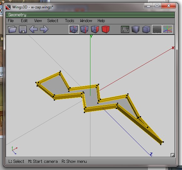
…now the cybernauts are investigating energy at the moment, or more importantly what it is and why that is important. It bridges to types of energy and sustainability and so on. My lagged brain came up with the notion of a “bright spark” as energy-related, so fired up trusty old Wings3D to make one.
I then edited the RWX file exported and changed the RGB lighting, and added a little less OPACITY, meaning by changing a number from 100 to 70, the object rezzes in-world partially transparent, which is sort of cool.
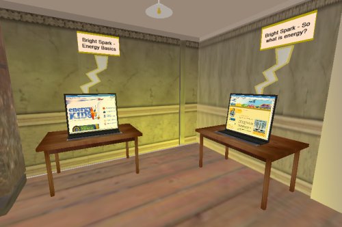
Information stations were then established containing links to websites, learning objects etc:
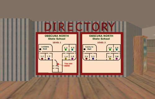
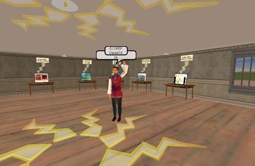
…and a little mood lighting above and it seems to work. I used classrooms 1.1 and 1.2, ground floor.
I have another 4 classrooms on this level to do the investigation into renewable and non-renewable energy. I think the location is ideal – adjacent to the eco-theatre, downstairs from discussion rooms and so on – all in all this building seems to be working out rather nicely.
So with a little decoration (can you see how the zappy things are a little bit see-through? This is the opacity of the model and I am guessing this is much less resource intensive as a way of gaining transparency than masking, which requires an initial surface and another surface modifying it) and the “Bright Spark” gallery is largely ready to go. Tried to add some “contribute your ideas” activities to the “click on stuff to find out about it” else I suspect this activity would have been better done as a web page.
…which brings up an interesting question – does being in the “world” add to the activity, or would a website be just as effective at engaging and immersing? Does this level of immersion matter at the ages our cybernauts are in, or does it provide a new level of distraction for kids who cannot multi-task at the best of times, or even single task at the worst of times?
Eco feet…
So, when visualizing a learning opportunity, I like to see it as a series of “stations” or activities, a journey if you like through the course material that hopefully provides a structured and developmental approach to the unfamiliar, one step at a time.
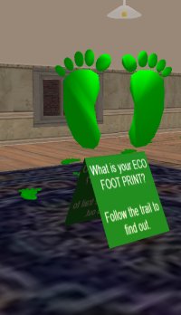
So, we are getting students to investigate their ecological impact on the planet. To do this, they explore an “ecological footprint” – so it seems natural they walk along a previously established path of green footprints.
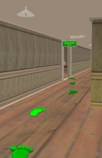
I like the visual metaphor of the trail of breadcrumbs – it is a universal “follow me” beacon. Students proceed from the rally point to investigate, down a labyrinthal corridor to room 2.3.
I have set up a room for this activity, and had to decide how to lead students in a linear way through a developmental sequence without tying them down so strictly they cannot investigate in an order that also suits their own style. Fortunately I had a lesson plan (thanks Deb) and so sort of used that as the skeleton for the area.
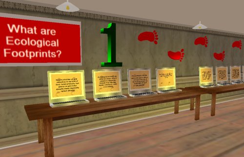 So, just inside the door of the room, we take students through what amounts to a rationale of what we are going to do and why that is a valid thing to do. I want to believe that students will read this but hope that their teachers have also done some of the ground work prior to the in-world experience; seeing this cold would be hard work for younger punters I suspect.
I used a “power point” metaphor here, but presented each slide on a separate screen – an information walk of types – the red foot trail emphasizing the start here and walk to here – I think it is clear.
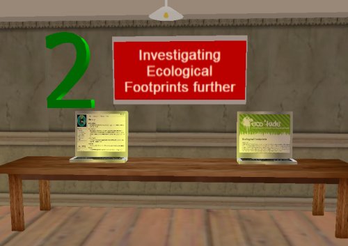
We then dive out to some robust reference material – each of these screens spawns a webpage in the in-world browser – one is a reference site on ecological impact that contains a fair bit of reading and some snarly vocab – the other is our glossary from our Wiki (a work in progress) which I think will help de-goddldeygook the references. The aim here is to allow them to become informed about issues and measures – with real classroom intervention this has the potential be a rich experience.
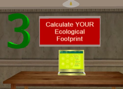
Punters now calculate their personal eco foot print – the site linked here is a neato flash learning object that delivers, via a series of point and click survey questions, the number of hectares their personal ecological footprint measures. They need this information, and it is nice and accessible, the language and visuals guide you in well thought out stages.
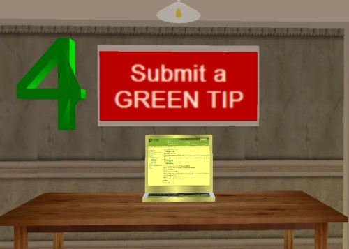
On their journey, they have formed opinions and got ideas on what are ecologically sustainable practices, good green things to do … so we ask them to post a “top tip” to a database-managed collection and then explore other contributions.
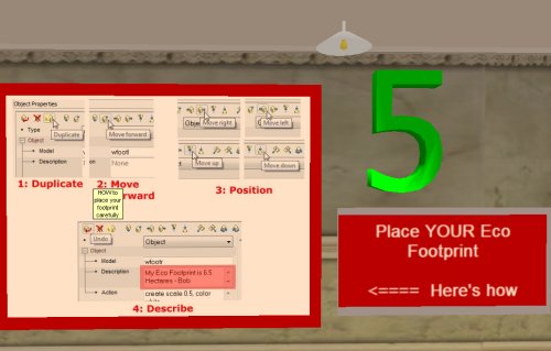
Next we ask them to use a little value judgement, and place their own personal eco footprint somewhere on a coloured continua (low impact .. high impact) – this necessitates a world-skill, that of making positioning and describing a new object.
Rather than just presume punters would know how, I thought making the process explicit was a good idea – we have seen some random, clumsy and inexpert spawning of response objects so far, so a little world-skill building is a good idea.
The visual metaphor of “cold” to “hot” I thought would resonate, and asking them to place it in a non-quantitative way should also get them thinking in comparative ways, at least that is the aim.
We have cybernauts in here next week, guess the proof of the design will be in the successful completion, and abundance quality discussion, idea sharing and (dare I hope) learning.
What do you think?
