Visitor Centre
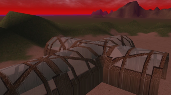
The main building, well the first one visitors encounter is the “Visitor Centre”. It introduces the idea that the atmosphere is not very nice by requiring you enter through airlocks, travel to adjacent buildings via tubeways.
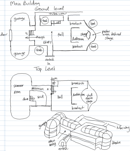
Here is my plan of attack (looks like a nail, no it is a tack – ha ha):
I decided early on that SciPrime architecture would be based wholly, or at least in part on industrial spheres and cylinders – I thought it made sense to have an endemic design principal that separated the worlds visually – in reality, all building materials would be brought here, and would have a similar modular basis so … yeah, I know, I am over thinking it.
The visitors centre serves a number of purposes – orientation, presentation and equipment.
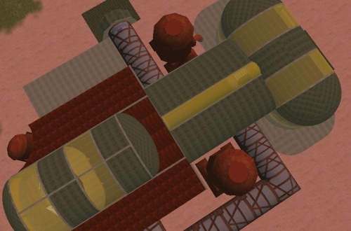
It is quite nice when a plan and the actual result match (at least to some degree) – still texturing and there is no clutter yet that would exist were this populated and being used, but I figure start with the infrastructure and tizzy it up later. Thinking of services, flow, construction and all is interesting. I learnt that I know very little about structural engineering, and am grateful that the buildings are not pront to actual gravity. This building is 2-levels – ground and upper – accessible via stairs and a ramp (thinking various modes of accessibility, although NO avatar is mobility challenged).
Human scale, function and look/feel or visual aesthetic matter -trying to make the place look like it might possibly exist is an interesting challenge, as is micro-positioning of the dozens of objects to compose a scene, scale and texture alignment and so on. Open plan means the spaces are flexible and multi-purpose – I wanted some of the outside to come in, so have been exploring masked metallic glass material for the strip windows and modular concrete/plasteel and iron for other structural components.
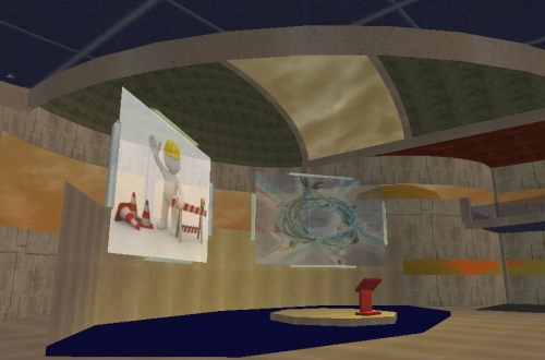
Speakers are now accommodated – here and at the Moon Room we have auditoriums – places where a speaker can, well, speak and an audience can, well, audient. Above the speaker are “sign” objects that can display pictures relevant to the presentation – not sure of the Activeworld capability to do this dynamically, but pretty sure I can get a bot to act as a slide-show operator. The lighting here is cute – stand at the lectern and it lights you up from the front so your audience can see you (well, I thought it was cute). There is a dress circle mezzanine above also for extra impact/capacity. Behind the stage there is a nice little area suitable for posters and other display. If you look directly at the stage, you are facing WEST -this building is west-east oriented and just over the lip of the crater you first land here in.
I will embellish the space with things you can use once more of the buildings are done – a reasonable start however I thought. In this centre we have seminar rooms, break out discussion rooms and a fairly intimate auditorium, all a tube-travel away from the dome cluster.
n00bs, gotta love ’em
… you land on this foreign planet, right, and you are the visitor, so what do you need to know?
That question is an interesting one – in a 3D world there is LOTS that you can know but what do you NEED to know.
context: punters are students years p-7, and their teachers, and some mentors.
I thought that concentrating on CITIZEN RIGHTS was a good starter – privacy, save place to learn etc, all good up-front.
Then come CITIZEN RESPONSIBILITIES – a little more fuzzy, but things like don’t break what is not yours, do not offend, clean up after you etc.
I figure if you place this stuff where they HAVE to walk past, at least initially, there is a chance they might read it – the wording and format … that is the part of the task that is like nailing jelly to a tree.
If I use “sign” objects, then there is a limit to the number of characters I can display, and I have nearly no control over the format (font size, wrapping, text effects), so will need to seek advice higher re visual styling and consistence, and I guess the actual wording. The “picture” object lets me embed an image version of the wording (that takes time, I prepared one earlier) which I think is the right way to go – styling and someone with the actual time to do this right now … umm, help.
I went for an industrial feel – the whole complex is old, corroded and not shiny so I think it fits. It still looks a bit spartan, yet to embellish and clutter, concentrating on the infrastructure first and will busy it up later. I used rusty “I” beams, thought they looked ok and let me expand when I need to, just get out the welder and we are away.
I included the obligatory “work in progress” – in much the same way a website is NEVER complete, I would be astounded if this world ever is finished – people long after I am gone will be adding/modifying/re-working I hope.
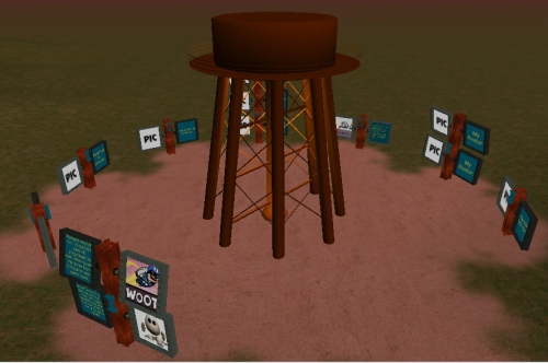
I included reference to a “basic orientation” or O-ZONE interestingly clustered around the base of the ozone tank, well I thought it was clever, and began to imagine what are the basic skills required to just drive the world – not building, that will be handled elsewhere, just the beginners guide to Activeworld use.
Moving; talking and more generally communicating; playing with your avatar; manipulating objects; remembering places; and taking pictures were what I first concentrated on – what have I missed?
It needs to be clear, concise, written in a language that can be understood by emerging literacies, it should where possible have companion illustrations, they should be fun, informative, simple but illustrative – all in all, quite a task.
I will have to ask for help I think as I am flat out designing and making the buildings – the level of accompanying documentation and illustration is important and will couch the activities that users involve themselves in when we are in production.
So … HOMEWORK: what do nOObs need to know? How do we tell them? What level of explanation is appropriate as an intro – can the skills be categorised? What sequence? How should they be displayed? All interesting questions dear reader – want to contribute to the discussion?
Who was that masked man?
Texturing is an interesting process – it can transform a boring primitive into something exotic and interesting – finding the right textures can make or break a sim. Textures “tile” if the surface is larger than the actual texture patch, so getting edges that seamlessly fit together is an artform in itself.
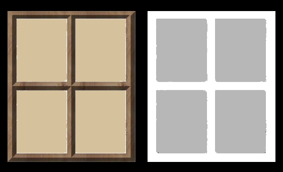
Texture artists use many tricks of the trade, one of the, “masking”, is particularly useful- you can have a texture and pair it with another image – the combined image can be interesting.
If you pair images with equally dimensioned masks containing WHITESPACE in areas you want untouched and colour/texture in areas you want to affect, then the masked result is useful indeed:
create texture wwindow mask=wwindowm

where wwindow was a jpg and wwindowm was a ZIPPED bmp, both uploaded
to the textures folder of the public object path
The intensity of the “masked” area effects the transparency of the combined region – had I scuffed up the texture or the mask, the resultant combination would also appear flawed. The tint of the transparent region seems to be determined by the tint of the original texture (note a beighy cream), the mask grey-level determines the transparency – closer to black, the more transparent and so on.
Careful selection of textures can effect the look and feel of a space, transforming simple shapes into convincing scenic objects.
Objects of desire…
…now it puzzled me that our brand new, shiny world, kept referring back to activeworlds.com – not that I have anything against aw (far from it, they have been incredibly supportive to the n00b that is me). It seemed strange to me that all world geometry appeared to be coming from them – when EQ admins testing the world entered SciPrime, all they saw was broken objects (and not my partially raised buildings)
Seems aw is blocked on EQ networks, which got me thinking that we should do it differently anyway. After getting FTP access to the “webroot” of the host server for MyWorlds, I placed a folder called “objects”, then sub-folders called “models”, “textures”, “sounds” etc. Then downloaded objects from archives, uploaded them to their respective sub-folders and ….
After tweaking the world settings to re-direct the object path to our location, we now have locally hosted objects live in-world. Now I have only changed the object path of ONE world so far – “Obscura” (our sandbox building zone) – in doing so I have broken all the existing links to scenery and atmosphere which makes for an interestingly sparse blank world (think training room from Matrix) – but I was able to pop newly uploaded objects and they arrive nice and fast.
Next task – fully populate our object path and then I can switch all worlds to our object path, then we should be cooking. Quite happy with this, it means we can also add our own geometry as well, and may be able to work out how to let users upload geometry also – imagine how wonderful it would be for users to be able to sculpt their own 3d objects and let others use them in-world.
…back to marking for the moment tho … oooh, shiny! Dang this interweb is full of stuff I would much rather be messing with – you gotta do what you gotta do tho I guess.
In the “zone” and feeling moody
One issue with a “world” is the global settings – particularly lighting. Now if you are outside, this is fine, you would consistently want the sun/moon in the one place [although a multi-sun world might represent a challenge still]. The ambient light [that which generally soaks everything non-directionally and the directional light that originates from the major light source [the sun] as a global setting lets you pick intensity, angle and colour. These effect objects differently using the SUBTRACTIVE colour model – let me explain.
We see objects in the real world as a particular colour because the surface of those objects are reflecting THAT colour light into our eyes. A red shirt looks red in white light because white light contains some red – the shirt absorbs all but the red which it reflects and we see it – got it? In-world objects have colour schemes also – if the grass, for example is to be seen as green, then there must be some green in the directional or ambient light, else it will not appear green. Lighting in a virtual world [activeworld and secondlife] model this same system so some interesting moods can be created and commonly recognised objects can take on new qualities if illuminated using different colours to those it would naturally appear under white light.
… however
If you create a chamber, with a roof and solid walls, say, the world light settings seep through and plainly illuminate the inside space just like it is doing the outside – this is weird to say the least.
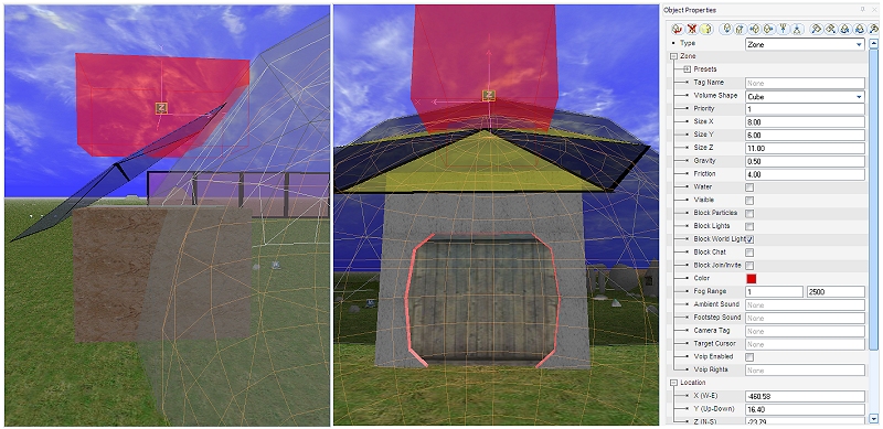
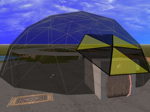
Activeworlds combat this issue by allowing you to create zone objects [rectangular prism, cylindrical and spherical] that let you apply local settings. In the above illustration, I have created and sized “red zone” to fit inside my airlock [but have yet to lower it in place]. Its ambient and direction lighting gives the user a feeling of being de-contaminated – red and dangerous looking. I also changed the local friction and gravity in this zone so it behaves like it is viscous to travel through. Similarly, inside the dome, I made a large spherical zone that filters outside light and lets my local lighting do the job it was placed to do.
So what? Zones will be very useful – we can make “holes” through our landscape but the global water table is just below the surface which by default means all stuff below that is full of water. To make a subterranean [or indeed a submarine or some breathable space below surface] you surround it in a zone that excludes the water and presto. Zones will let us make detailed and moody interiors as well which will greatly add to the sense of space.
With a simple concrete “plinth” in place, the dome looks a lot more like it belongs there [a narrow collar would also help from an engineering perspective given the inside struts etc – the beauty of a virtual world however is that the rules of building are not restricted by the forces of gravity or tightly bound to the laws for physics, popular culture or bad taste so we can get a little liberal with the building regulations depending on the culture we are depicting. I floated a second floor donut [well, technically it is a torus, but it is near lunchtime so donut is fine] as a circular viewing gallery – I will re-wire the lift to take you up and down I think and it might be useful practise plotting waypoints.
I added some programmed light sources to see if I could [I wonder how often exploration is justified for “shits and giggles”] and we start to get a feeling for the place. Above the the outside airlock there is a red light – when you activate the door, the door tells the light to go green [to indicate all is ok to enter]. When you travel beyond the threshold of the door it closes and changes the light back to red. I will leave my magic carpet parked outside, but might see if I can find a Dalek exoskeleton to travel around in [I am a geek if nothing else 😛 ].
