Lego for big kids…
…so our punters are over Lego, in a big way, and are ready for challenges that are more real. I guess I over estimated the connection they wold feel with Lego – how quickly we forget the ages that toys are appropriate to kids.
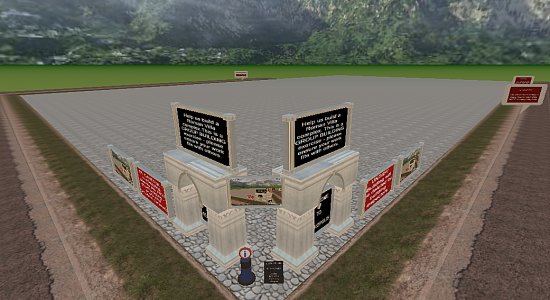
Cybernauts will eventually be building things to solve problems, in the interim they need a challenge that exercises their builders skills, so I thought of a group building challenge – Retropolis, an ancient Roman Villa complex/compound.
I cleared the Lego pile (sorry kids, it was bugging me), extended the bay a little, lay down some cobbles, erected signs issuing the challenge – “Build us small a Roman town”, together. I recorded a video (you can see it playing on 3 screens as part of the welcome facade) explaining what was necessary, pointing out what was where and what they had to do. I think it makes sense – what do you think?
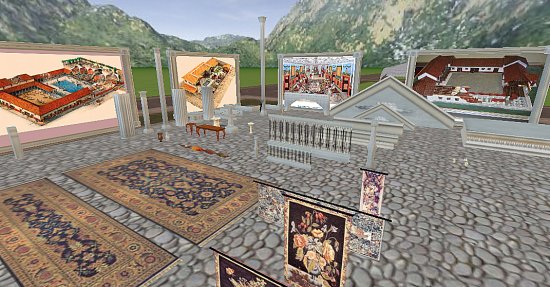
I then set about assembling a collection of Roman ruin bits and pieces – scaled so they fit together nicely, accessories and so on, and lay out an object yard – this saves them time searching for period-correct things.
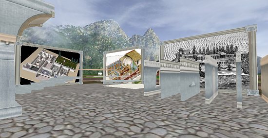
It occurred to me that I was assuming they had some idea of what a Roman Villa complex might look like, and i have found assumptions to be problematic at best, so decided to provide some inspiration – thank you Google I found plenty of villa-inspired plans and diagrams, of which I constructed billboards to display them.
It will be interesting to see how it develops – scale and scope are something primary kids seem to struggle with – they go large before thinking about practicalities or human-scale. They think large will impress when actually detail and control are more admirable. They see super structure and do not think through the practicailties of gravity, weather, basic physics, terrain etc – this is both wonderful and an issue when trying to construct something that looks convincing.
…the challenge is issued, with the proviso that untidy/un-Roman building will be demolished. How will they go? I honestly have no idea, but see nothing but potential (particularly in the light of the success of SkyCity). We shall see…
iObject v1.0b
…so, in a previous post I ranted about the need for an in-world Object Catalog, as opposed to an object yard.
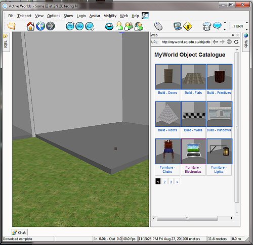
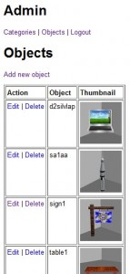
In-world, the object catalog manifests itself (thanks to some nifty PHP development by Malcolm) in the integrated browser:
Cybernaut builders browse the categories of objects, textures and so on available to them in the MyWorld object path, then…
…then pick a category that suits the sort of object they are looking for, then
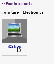
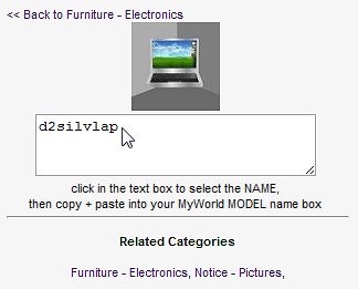
…browse the paginated list of objects, via their thumbnails, then then click on the object to get a copy-pasteable link to the object name which they then use to customize the objects they have just cloned. I like that when you click on the name, it is highlighted – then via copy-paste you have the thing you need to make one, the model name. This will also work with textures, of which we also have a HUGE collection.
It is all controlled by some back-end database work, we control the categories, thumbnails and so on, which is all very hoopy.
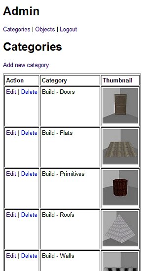
This version is functional and awaits instantiation with the actual object collection, which necessitates the ADMIN section to upload, add, edit and manipulate the collection into something workable.
The next stage is to get lovely, patient people to systematically pop objects in a lightbox and screenshot them:
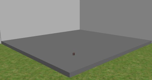
…so I made a cluster of oversize (as some objects are huge) photo booths on a yet-to-be developed world, popped a blank primitive on the ground plane as a seeding object, then began concocting instructions for our intrepid catalogers.
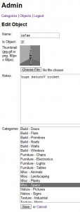
We have a category hierarchy which I have begin to populate – building objects, furniture, accessories etc, and within these, sub categories:
By prefixing the name, we group them in the resultant catalog screen (which is a paginated, alphabetic sort), and no, I am not sure I have got them all yet – the available object collection is VAST and I have no doubt that new, functional category names are staring me in the face but for the life of me I cannot see them, yet.
Managing objects via Delete/Edit and Add all seem to work nicely according to spec (I wanted a compact catalog that would fit as a sidebar to the world screen, hence it’s compact appearance and slick nav.
Having done a few add/edits (and discovering application/permission glitches subsequently fixed) and doing some cosmetic changed to layout and captioning, I think we have a functional system that is ready to rock and roll.
I like that an object can be in more than one category – the silver laptop to the left, for instance is a bit of electronics gear as well as a picture object (you can place a nominated web-hosted image in it’s screen).
Some objects can be used for multiple jobs – flats can be floors, ceilings, ground covers etc or if you tip them on their sides, they become walls (remember I built 99% of the science bunker out of a “wall1” object – using it as walls, floors, ceilings, steps, balustrade and so on by rotating, scaling, texturing and masking).
Will this work? I am not sure – I think so, it is so much more convenient that trolling through an object yard and the best thing is the URL for the catalog works out of world, so you can realistically plan a build without being in world. Great for cybernauts who want to work effectively – planning the build is much of the work.
What is left? Well, (after I get current object path directory listings) the hard slog of filling it up is the next priority … DebJ, I hope you have some patient volunteers to help in that regard because I am buggered if I want to do that by myself.
There are some niceties I would like for iObject2.0 – mostly web twoey things, probably a larger view of the object (80x80px as the only preview of an object is a little small), surfacing of the “notes” section might also be nice to value add to what is known about an object as some have oddities or companion files, along with collapsible folders, general branding and some automatic re-scaling of uploaded images, but they are for another budget I suppose – am more than happy with the start we have.
Bright Spark…
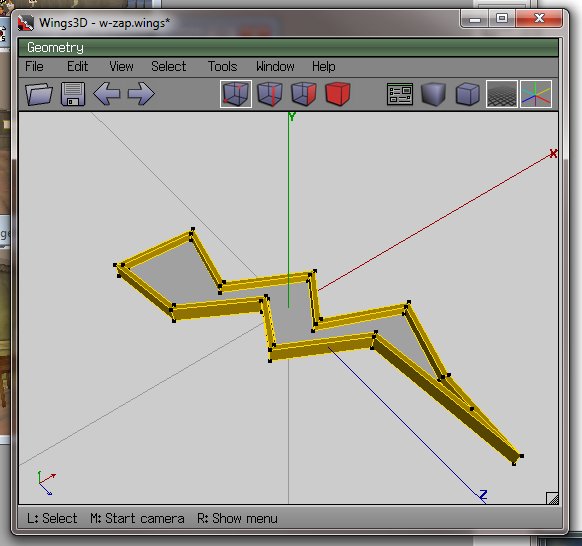
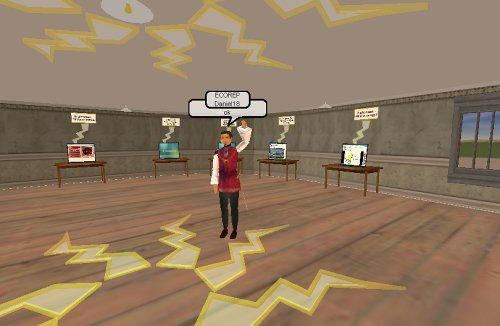
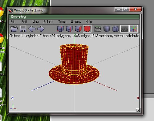
…now the cybernauts are investigating energy at the moment, or more importantly what it is and why that is important. It bridges to types of energy and sustainability and so on. My lagged brain came up with the notion of a “bright spark” as energy-related, so fired up trusty old Wings3D to make one.
I then edited the RWX file exported and changed the RGB lighting, and added a little less OPACITY, meaning by changing a number from 100 to 70, the object rezzes in-world partially transparent, which is sort of cool.
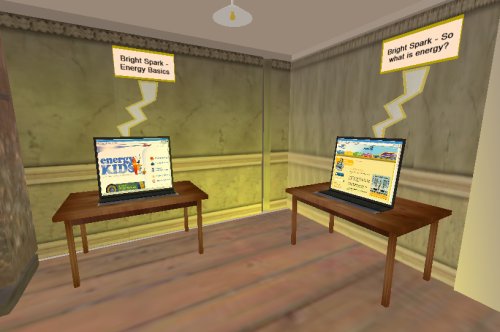
Information stations were then established containing links to websites, learning objects etc:
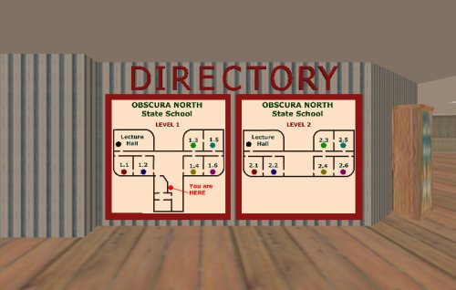
…and a little mood lighting above and it seems to work. I used classrooms 1.1 and 1.2, ground floor.
I have another 4 classrooms on this level to do the investigation into renewable and non-renewable energy. I think the location is ideal – adjacent to the eco-theatre, downstairs from discussion rooms and so on – all in all this building seems to be working out rather nicely.
So with a little decoration (can you see how the zappy things are a little bit see-through? This is the opacity of the model and I am guessing this is much less resource intensive as a way of gaining transparency than masking, which requires an initial surface and another surface modifying it) and the “Bright Spark” gallery is largely ready to go. Tried to add some “contribute your ideas” activities to the “click on stuff to find out about it” else I suspect this activity would have been better done as a web page.
…which brings up an interesting question – does being in the “world” add to the activity, or would a website be just as effective at engaging and immersing? Does this level of immersion matter at the ages our cybernauts are in, or does it provide a new level of distraction for kids who cannot multi-task at the best of times, or even single task at the worst of times?
Clothing hacking …
…so when you make something in Wings3D, the geometry forms a VERTEX (or 3d point) cloud. It’s solidity is comprised of polygons that are the result of the correct sequence of this “join the dots” to make FACETS that can then have visual properties of colour, texture, specularity, reflectivity, opacity and so on applied to them.
When you choose tools in wings to “color” each facet, it modifies the UV mapping of that facet when rendered in-world but the light model used by default (and no, for the life of me I cannot find how to change this) is a little odd – any colour you choose in wings is really, really light in-world (black looks light grey, blood red comes out light pink and so on). Wings has EXPORT as RWX, fortunately which is luck as RWX and COB are the two supported object definition formats Activewords seems to use.
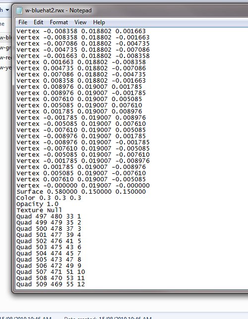
The resultant RWX (object/model definition file) contains the locations of each vertex in x-y-z terms, relative to the centre point of the cartesian plane (0,0,0) where the object was sculpted, and the order these points are joined to make a polygon mesh [you will notice I have opened up the object file in notepad – geometry purists argue you do not need anything else than notepad to make objects – they are out of touch nerds who need to get a life in my opinion 😛 ]
Fortunately, after breaking a bunch of RWX’s, I have stumbled across (yee gods, why does no one document this junk in a way HUMANS can read) a tweak – you can effect the overall colour and opacity of the model by defining the overall luminance – I have found 0.3 0.3 0.3 (for RGB) seems to work pretty well for most colours (except for yellow which comes out muddy and brown).
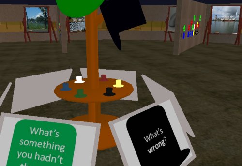
With some tweaking, my DeBono Hats finally look like they should:
These “player controlled” movers are worn – by clicking on them, users stick them to the heads of their avatars and they look quite cute (in a top-hatty sort of way). Punters, through their avatars adopt a DeBono thinking mode, and then you walk over and reflect on an issue using that mode – you can see in the background some kids have already started doing just that.
It is nice when an idea finally coalesces into the shape you wanted it to be (or is it just me being anal and doggedly plugging away at an unimportant detail until I am happy with it?) – prolly a little of column A, little from column B.
iPost 3.0
… now there is this big eLearning showcasey thing next week for EQ people but I will not be there because I am not, well, really an EQ person (Hi if you are a delegate reading this, I am speaking to you from the past … how weird is that?).
The Learning Place wants to showcase some of the aspects of MyWorld that already exist – a golden opportunity to show some of what has been done already, as a stepping stone to what can be done in the future…
… so it got me thinking what sort of symbolism is naturally “tourist-focussed”.
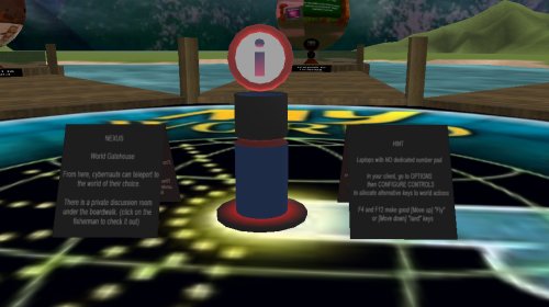
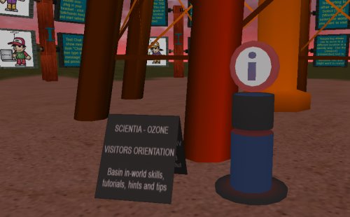
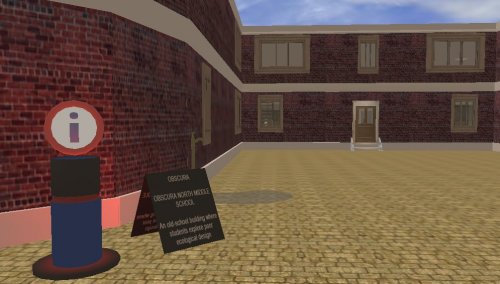
I know when I am in a strange place, being a tourist, I head for the big blue “P” signs to park and the big blue “i” signs as they usually mean INFORMATION, so I set about designing an “information post – or iPost for short”. It took 3 goes until I got one that I was relatively happy with, hence iPost3.0. They are made up of 2 parts (w-iPost1.rwx and w-iPost2.rwx, with part 1 being the base that throbs with a red “notice me” beacon, and part 2 the disk with the “i” rotating gently).
Wings3D is a useful mesh sculpting tool, and I am getting good at sculpting custom geometry, and beginning to understand the structure of a rwx file, so eventually I will be able to hack (without breaking) them to add texture, light, shading and other attributes.
DJ gave me a list of itinerary points she wanted to feature, so I set about setting out a trail of iPosts. It became apparent that each iPost would need some form of annotation so the tourists could nav and learn as they were going, without having to wait for a tour guide, so I included with each iPost a notice board with some simple orientation info.
The challenge was to make them visible, but not dominate the areas they sit in – they are, after all merely one way through the worlds. I hope we highlight some of the good ideas and work that has already been put into this world – a beginning in some ways, providing muct potential for young learners.
I used a mixture of teleports (instantaneously “arriving” at the destination when on another world, or where scenery gets in the way) and warps (fast forward travellators for placemarks that are within cooee of each other) and I think the mix works – warps are particularly useful for giving a sense of space, scale, direction and displacement and can be a fun ride.
I discovered an issue that is potentially disorientating – when you teleport to part of a building, you may arrive before the building does, particularly problematic if that location is upstairs – you plummet to ground and then the building arrives around you effectively trapping you. The iPost above is the result of being bounced behind a building with the next jump taking you into it – thereby giving the world a chance to catch up with the traveler – caching the geometry as it were, pre-fetching it before you wind up trapped in it. This all depends on the net connection, bandwidth and so on, not sure i can do much more about that.
I have had a couple of guinea pig cybernauts test it out, it is a circuit – tourists can join it wherever they see an iPost. We can either leave the tourist trail in place after the event, or HIDE the iPosts until they are needed again.
Will it be successful? I have no idea – maybe the punters will tell me. Is there anybody out there?
