It’s just a jump to the left …
Navigating insurmountable distances is, naturally enough, a pain. When we have a number of worlds in our universe, then travelling between and betwixt is annoying. There are many solutions, and I suspect we shall see them all (and some I have not yet thought of) emerge as the universe expands and develops.
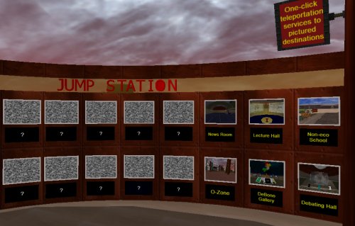
Our first “Jump Station” is conveniently near the initial spawn point on the home world. It provides one-click access to places of interest. I think this approach makes sense, particularly when activities are spread over a wide geographic location.
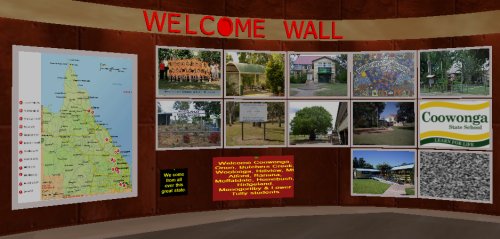
While I was making our jump station, it occurred to me that it might be nice to welcome our groups of cybernauts, so fashioned a “Welcome Wall” as well, after an idea I saw DJ wrestling with.
Some sense that they are expected and welcome was the aim, and given that the punters pull from a wide variety of geographic locations also, it is a good idea to have them know where they sit and a bigger picture of where others are from also – virtual worlds are brilliant for conquering the tyranny of distance (as any dedicated user of synchronous technologies will attest). All set to welcome our first wave of cybernauts it seems.
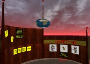
One of the activities planned is a naming competition:
We ask in-world punters to name our girl, boy and k9 cybernaut companions. Initially I had the notion they would be our Dick, Dora and Nip (or more modernly Sam, Pam and Digger … oops, 2 more copyright laws breached? I claim “fair use”) but think it fitting that the waters be tested with our punters – kids have much better imaginations than us old people anyway.
What do you think we should call our in-world companions? (He asks, knowing nearly no one actually reads this stuff)
Anyway, buildings are being purposed and fitted out with furniture, accessories and most importantly, interactive bits and pieces.
The dome made using the working title “The Blue Room” is now our Gallery Walk.
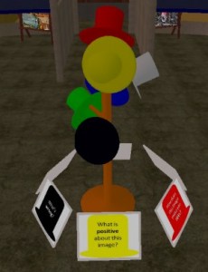
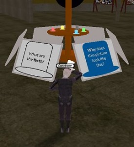
Featured in the Gallery Walk currently is a DeBono Thinking Hats exercise, where cybernauts examine images and then ask themselves things related to the six different ways of thinking about an issue, and respond accordingly. In constructing this zone, I decided to make a hat in 3d (thinking literally here, complete with hat band) and then, when placing them in-world, decided they would best be displayed on a hat stand, which I then also made, after wasting nearly an hour in the object yard looking for anything that might convincingly be purposed as a hat stand. I “think” I can make the hats stick to the head of the punter also – as in they “don” a particular colour hat literally when talking using that point of view – will explore that idea (as a “carry item” mover) as it sounds cute – not sure how easy it will be to place it on the head, if all avatars body geometry is tricky, but will give it a whirl.
The Blue Room seems to fit this exercise really well – it is sectioned off, has a separate area that can be used for display and presentation and has lots of wall space for posting ideas etc. News room to make now … read all about it!
EDIT: in a blindingly obvious (after screwing it up a few dozen times) application of a “pick up item” mover, punters can now WEAR the DeBono hat of their choice whilst adopting that point of view – quite chuffed about that actually.
You attach (or link) the mover to a tagged location on the body (the head, for instance is 4), then tweak the u/d displacement depending on where the origin of the object is, then control the relative displacement front/back, left/right so it sits convincingly on or near the top of the head.
When worn, the hat nicely follows the movement of the head. I chose lighter tones of the 6 colours so they were obvious when worn and made a little shelf to sit them on, adjacent to the posters providing lay-summaries of the 6 ways of looking at something.
… well, I thought it was pretty neat at least.
Sittin’ on the dock of the bay…
…now it occurred to me that people would want to sit around and discuss things in world. Whether it is at a table, bus stop, campfire circle or octopusses garden, in the shade.
This sort of thing is almost trivial in Secondlife so I assumed it would be equally common in Activeworlds. Oddly, in searching, I found nearly NO information about making seats – this perplexed me as I assumed it was something people would routinely want to do with their avatars – in meetings, say…
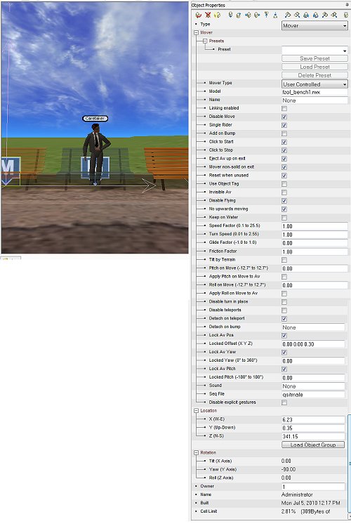
…so I got me thinking – a “mover”object lets a character attach themselves to it – now this is usually used for vehicles and so on, and often the avatar is hidden whilst on a mover as all the documentation suggests making posture sequences for avatars so they look like they are sitting “in” the vehicle were more trouble than they were worth (again, not a good sign, nor very encouraging).
The trouble with movers, is, well … they move – lol. Yes, I know that sounds obvious, but the last thing you want a chair to do when you are sitting in it is to let you then steer it around the room like some feral “baby walker”.
Hidden away in the sequence files for avatars were sequences with esoteric names like “qsitmale” and “qsitfem2” [only 4 from hundreds of preloaded sequences] – no wonder I missed them. A mover can be “disabled” making it stationary, you can tell the mover to grab the avatar and place them in a particular place, orientation and displacement to the centre of the object you have chose as the mover when the person clicks on the seat object – all very neat and just a little bit fiddly to work out what directions were which initially – sometimes it is absolute world coordinates, other times relative the the object, other times relative to the avatar’s aspect, sometimes relative to the direction the person’s camera is currently pointing … grrrr.
There are literally hundreds of sequences for all sorts of gestures and actions, from nodding, to performing the “macarena” but oddly nearly NONE for sitting. I think I can see why – avatars have jointed bodies, the distances from ankle to knee, knee to hip all vary avatar to avatar. Having an avatar sitting convincingly, depends on their body geometry. What looks good as a sitting position for a short character, has a tall avatar floating oddly above the seat, or visa-versa one that looks good for a tall avatar has a short avatar sunk oddly into their seat.
Some tweaking and I have some acceptable sitting attitude parameters that I can now apply to chairs, stools, bean bags, hollow logs and campfire circle stones which is ok if the seat is elevated off the ground a little. I have yet to find anything that looks remotely like sitting with cross legs (on a picnic blanket, say), but that is for another search [unless any of my devoted readers have a solution they would be prepared to share … is there anyone actually reading this?].
Progress is progress I guess.
Build it and they will come…
Yes, it has been a while, it is not that I have not been busy, just had other priorities than blogging about it I guess. Linear time is an interesting beast – things get in the way of other things and before you know it you have lost touch … neways.
Am puddling away on “Obscura” the Builders sandbox in MyWorld and have started laying out plots for our student builders to use, land subdivision is time consuming, but laying out some order now will help keep it clean later I think.
I have this idea for a builders academy, a sculpture park … more next post on that.
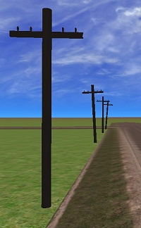
As part of “Year of Sustainability” we are making an eco-disaster “school” in Northern Obscura. I decided that power poles were necessary to feed their voracious need for electricity, so fired up trusty Wings3D and sculpted one (starting with a cylinder and being organised in my mesh warping – very happy with the results. Still have to work out how I might string power lines between them, but that is for another time I guess. The scene to the left reminded me of a Talking Heads song “Road to nowhere” which it feels like when walking that end of Obscura’s northern arterial road.
Neways, Obscura North Middle-School is taking shape, and I thought it high time I reflected on the technique I use to make large buildings. On reflection, as I walk around it reminds me of the old brick building that formed the original precinct of Brisbane State High (which was my reference structure incidentally – only the facts have been changed to protect the innocent :P).
 Plan, plan and plan, then, when building, change everything – lol. Sorry, sounds flippant and it is not meant to. I plan the superstructure but often ideas for detailing emerge as you are making structures and sometimes they are good ideas as well, more often however they plung you into a special form of hell where you make a change then all too late realise there is NO undo facility. I have become skilled at caching of structure and trying something different in its place only to decide I hate the new thing and rolling the old back into place, if you understand what I mean.
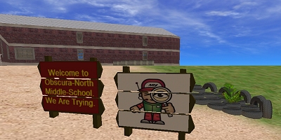
Meet “Sam” the nominal name for our male cybernaut (“pam” is our girl cybernaut until someone thinks of better names at least that do not breach copyright laws or culturally isolate or offend). He is investigating, cute, hey. More importantly, notice the tyre retaining wall replete with weeds and a looming and gloomy brick monstrosity in the background. Multi-story buildings can be easy – build one floor and clone, raise, align and presto – this all goes pearshaped I noticed if you want to do more interesting shapes – assuming X, Y and Z are constants for geometrical pieces is fraught with difficulty, particularly when you re-use a piece flipped, twirled or mirrored.
So this building was originally one big barn, I decided that sucked, so added a portico which will house reception, headmasters office and a teacher staff room (it is a school, remember). The main building is 2 storeys high and each story consists of 8 classrooms organised into west and east tings surrounding a central rear courtyard, connecting corridors and appropriate doors and a central staircase (although that is a pending challenge).
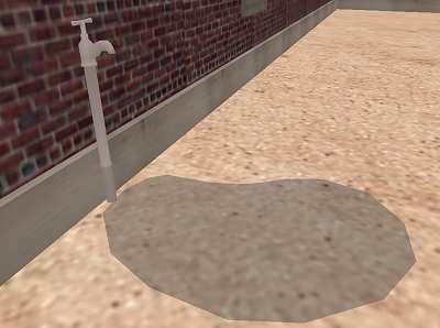
The devil is in the detail you see. I fired up wings and sculpted a tap (again starting with a cylinder that was extruded, scaled, warped, inset, bevelled, smoothed, extrapolated and a bunch of other multisyllabic transformations that I barely understand) – am quite proud of the results actually – it actually looks like a tap. I will add a particle system to make it drip, and the puddle underneath it is animated ripples, pretty hoopy (that is going to leave a stain).
I have found building (in Activeworlds or Secondlife) is a tension between getting the superstructure done and adding details – a tension I have not fully resolved and am so easily drawn off task looking for (or making) a little detail that probably no one else will notice – I love the fiddly bits (in much the same way Slartybartfast loved the crinkly bits around fijords etc) so I rarely build in a very sequential way but there is an organisation there – the result of this is that visitors often think my early building sites are more like bomb-sites. You get that. An added side effect is that I know where thigns are going, the construction usually goes up pretty quickly when I get to it.
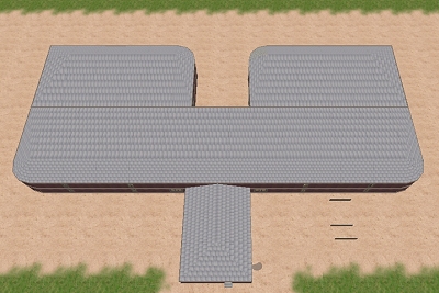
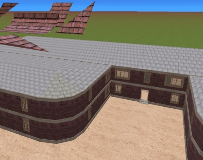
So anyways, I had this idea for nice round edge bits strategically located – well, in honesty it was first a divot in the back of the building to make it sort of “U” shaped, creating 2 wings. Then I thought the outer corners might look good rounded off, which led to an interesting roofing dilemma.
Enuff said, really, conical sections and pyramid sections, and getting them to seamlessly join up with slanted scaled sections led to some interesting uses of some very rude words, until I devised a scheme that harnedssed the northness, eastness and up-down-ness of nearest neighbours … needless to say however there is a solution and you are looking at it with awe and wonderment, I am sure. That said, the majority of the outside of the building is done, bar finessing and accessorizing – there has gotta be bins, junk, an incinerator (does anyone else besides me remember when schools had these?) and associated broken play equipment and other biohazards.
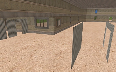
Superstructure up, windows glassed and scaled in place, we (well, I do, I am not sure someone else has a more sensible way to do this?) move inside. There are a number of imperatives – floors, then walls, then staircases I think. there will be a slightly raised ground floor, ceiling and top floor levels will differ also – it woudl look odd to have carpeted ceilings. These flats will dock with the concrete beams to make neat edges. This will create discrete spaces that then need to be purposed – enriched with literature, web links and other things, so quite a bit to do.
This stuff, although some would find it mundane, interests me greatly. I am constantly surprised how readily I lose all sense of time when working on this (2.30am last night before I looked up and noticed the time). It is like a jigsaw puzzle from hell, but when it coalesces into something usable it is a satisfying feeling. Scale is large as I want to be able to use this place as a meeting place also later (thinking recycling, a general purpose building that can be re-purposed later is good thinking, surely).
