iObject v1.0b
…so, in a previous post I ranted about the need for an in-world Object Catalog, as opposed to an object yard.
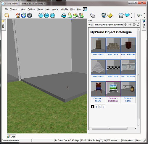
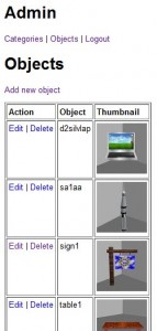
In-world, the object catalog manifests itself (thanks to some nifty PHP development by Malcolm) in the integrated browser:
Cybernaut builders browse the categories of objects, textures and so on available to them in the MyWorld object path, then…
…then pick a category that suits the sort of object they are looking for, then
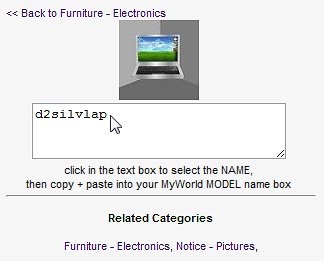
…browse the paginated list of objects, via their thumbnails, then then click on the object to get a copy-pasteable link to the object name which they then use to customize the objects they have just cloned. I like that when you click on the name, it is highlighted – then via copy-paste you have the thing you need to make one, the model name. This will also work with textures, of which we also have a HUGE collection.
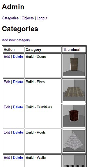
It is all controlled by some back-end database work, we control the categories, thumbnails and so on, which is all very hoopy.
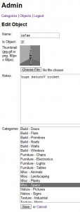
This version is functional and awaits instantiation with the actual object collection, which necessitates the ADMIN section to upload, add, edit and manipulate the collection into something workable.
The next stage is to get lovely, patient people to systematically pop objects in a lightbox and screenshot them:
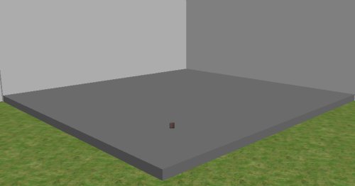
…so I made a cluster of oversize (as some objects are huge) photo booths on a yet-to-be developed world, popped a blank primitive on the ground plane as a seeding object, then began concocting instructions for our intrepid catalogers.
We have a category hierarchy which I have begin to populate – building objects, furniture, accessories etc, and within these, sub categories:
By prefixing the name, we group them in the resultant catalog screen (which is a paginated, alphabetic sort), and no, I am not sure I have got them all yet – the available object collection is VAST and I have no doubt that new, functional category names are staring me in the face but for the life of me I cannot see them, yet.
Managing objects via Delete/Edit and Add all seem to work nicely according to spec (I wanted a compact catalog that would fit as a sidebar to the world screen, hence it’s compact appearance and slick nav.
Having done a few add/edits (and discovering application/permission glitches subsequently fixed) and doing some cosmetic changed to layout and captioning, I think we have a functional system that is ready to rock and roll.
I like that an object can be in more than one category – the silver laptop to the left, for instance is a bit of electronics gear as well as a picture object (you can place a nominated web-hosted image in it’s screen).
Some objects can be used for multiple jobs – flats can be floors, ceilings, ground covers etc or if you tip them on their sides, they become walls (remember I built 99% of the science bunker out of a “wall1” object – using it as walls, floors, ceilings, steps, balustrade and so on by rotating, scaling, texturing and masking).
Will this work? I am not sure – I think so, it is so much more convenient that trolling through an object yard and the best thing is the URL for the catalog works out of world, so you can realistically plan a build without being in world. Great for cybernauts who want to work effectively – planning the build is much of the work.
What is left? Well, (after I get current object path directory listings) the hard slog of filling it up is the next priority … DebJ, I hope you have some patient volunteers to help in that regard because I am buggered if I want to do that by myself.
There are some niceties I would like for iObject2.0 – mostly web twoey things, probably a larger view of the object (80x80px as the only preview of an object is a little small), surfacing of the “notes” section might also be nice to value add to what is known about an object as some have oddities or companion files, along with collapsible folders, general branding and some automatic re-scaling of uploaded images, but they are for another budget I suppose – am more than happy with the start we have.
Bright Spark…
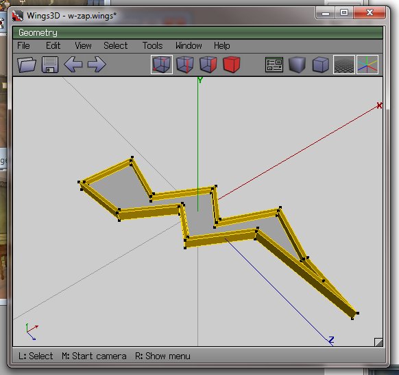
…now the cybernauts are investigating energy at the moment, or more importantly what it is and why that is important. It bridges to types of energy and sustainability and so on. My lagged brain came up with the notion of a “bright spark” as energy-related, so fired up trusty old Wings3D to make one.
I then edited the RWX file exported and changed the RGB lighting, and added a little less OPACITY, meaning by changing a number from 100 to 70, the object rezzes in-world partially transparent, which is sort of cool.
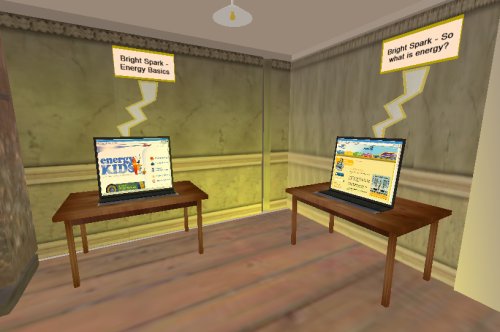
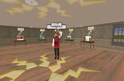
Information stations were then established containing links to websites, learning objects etc:
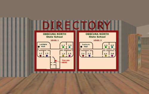
…and a little mood lighting above and it seems to work. I used classrooms 1.1 and 1.2, ground floor.
I have another 4 classrooms on this level to do the investigation into renewable and non-renewable energy. I think the location is ideal – adjacent to the eco-theatre, downstairs from discussion rooms and so on – all in all this building seems to be working out rather nicely.
So with a little decoration (can you see how the zappy things are a little bit see-through? This is the opacity of the model and I am guessing this is much less resource intensive as a way of gaining transparency than masking, which requires an initial surface and another surface modifying it) and the “Bright Spark” gallery is largely ready to go. Tried to add some “contribute your ideas” activities to the “click on stuff to find out about it” else I suspect this activity would have been better done as a web page.
…which brings up an interesting question – does being in the “world” add to the activity, or would a website be just as effective at engaging and immersing? Does this level of immersion matter at the ages our cybernauts are in, or does it provide a new level of distraction for kids who cannot multi-task at the best of times, or even single task at the worst of times?
How green is my …
…so we are going to embed resources and activities about atmospheric science, and green house gas emissions, naturally I thought the most logical place to do this was inside a greenhouse.
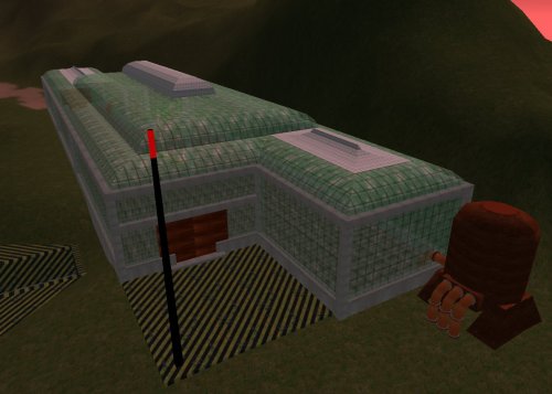
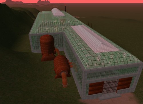
I had a plateau set aside for this building, nestled nicely in the southern ranges on SciPrime. Rather than just build a rectangular thing, I decided on a few protuberances and sexy roof line, and I used a primitive texture (the default build texture as it happens is sort of greeny griddy stuff) with some transparency masking to give the illusion of reinforced glass panels (well, it looks like that to me at least).
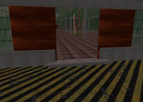
I remembered a scripting trick that let me do nice rusting (the sciprime predominant theme is rust, just in case you are wondering) sliding doors – you click one, they both open because you tell each of them about each other. After lab-rat testing with some in-world cybernauts, it appears they need to stay open for about 10 seconds before automatically shutting – that seems to work as a reasonable time to get through for even noobs.
I found the sound that was used for the original star trek door opening (a sic-fi woosh) and that is the sound made as the doors slide open (well, I thought it was cute at least).
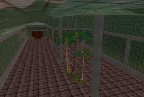
I have not yet kitted out the interior as I am still awaiting the content from our science curriculum expert, but thought some irrigation/humidity would be a nice touch, so found some “rain” that moves, and a few cycads and ferns to give a primordial tropical feel – have yet to add garden beds, organic matter etc. but we will subdivide this space into a few project/display rooms.
You _may_ be able to see the tanks and pipes – completest me has devised a water and nutrient recyc system, tank farm and engine plant – I do not think the extra effort is wasted, I aim for reasonable (or at least partly believable architecture)
So we now have an upper terrace occupied by the atmospheric research centre, the terrace below will house the “Collaboratory”, the terrace below that will house the soon-to-be-relocated non-eco school. Underground this mountain range here is the science bunker, so we are beginning to get a science-themed compound. Quite happy with the progress – amazing what can be done in the wee hours of the night.
Grand Design …
So I raised [or does that mean demolished?] a mountain range to the south of the visitors centre on SciPrime with the express intention of building a science-based activity centre there. I elevated plateaus, ridges and sculpted ravines so it would be interesting terrain – incidentally it is the MOST fun place to drive over in a vehicle – such a fun ride. I can see why 4w drivers love to bush bash, in an activeworld however you do not get physically thrown around the cabin of your vehicle as you hurtle off a cliff and plow into a ridge.
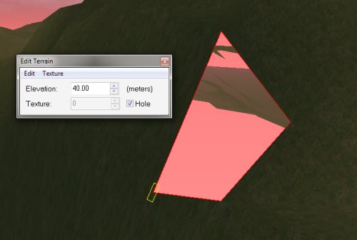
One of the “texture” options for elevated terrain is the ability to make the terrain tile a HOLE – that is, no texture, you can fall in. You can see that subterranean life looks a little odd, with atmospheric colouring and (if I had defined a water table, there would be a high-tide mark also).
It got me thinking that there was a lot of space UNDER the mountain range that was going to waste, so I decided that part of the science activity centre would be under ground.
…so I set about making walls and floors from an initial entry staircase leading down from a plateau into a hole. It actually felt like I imagine those early Egyptian tomb archaeologists felt as they inched down a discovered stair case towards who knows what.
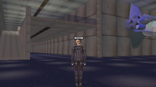
The scale of the build is striking – a huge entry hall, then it splits into north and south wings, each 2 storey with, I must say, lovely staircases. these wrap around a huge cavernous exhibition hall.
My inspiration? the entry cavern outside the Queensland Museum – one of my favourite places to sit, chill and listen to whale song [yeah, that was where I was going, but the entry cavern is a “space exploration museum” so i will layer it with some old NASA audio recordings I think]
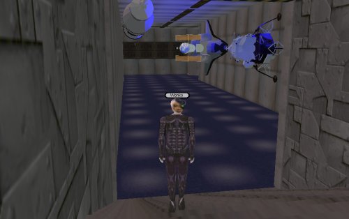
I found some old space junk, added some mood lighting and, voila, instant atmosphere.
With a little decoration (thinking ventilation and atmospheric recyc, we have a convincing bunker complex with heaps of space to lay out activities.
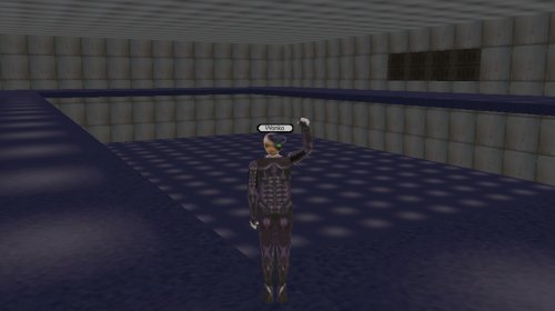
A truly huge and very flexible space is the Exhibition hall – we can set up stages, trade fairs, displays – a pool or tennis court (there is room for both) in here, and interestingly I do nearly the whole of this build using only 1 type of object – a “wall1.rwx” (why? actually, because I wondered if I could make something interesting with very few different parts).
It’s dimensions beggar imagination – and parts of it are so far way then do not rez all at once – which is funky and possibly problematic, but if needs be I can bisect the space into 2 huge theatre spaces, ditch some mezzanine and still have room for tons of stuff.
Walking/flying around stuff this big is tiresome, so will investigate personal transport I think, maybe some warp/jump pads for punters to move around, I will see how it pans out as the space is deployed. Most of this space is flagged for “alternative renewable energy research” and there is heaps to do, will see what is left over when done.
Greenhouse above to do next … all in all an interesting time
iPost 3.0
… now there is this big eLearning showcasey thing next week for EQ people but I will not be there because I am not, well, really an EQ person (Hi if you are a delegate reading this, I am speaking to you from the past … how weird is that?).
The Learning Place wants to showcase some of the aspects of MyWorld that already exist – a golden opportunity to show some of what has been done already, as a stepping stone to what can be done in the future…
… so it got me thinking what sort of symbolism is naturally “tourist-focussed”.
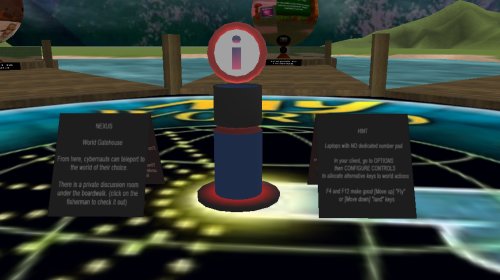
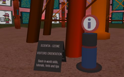
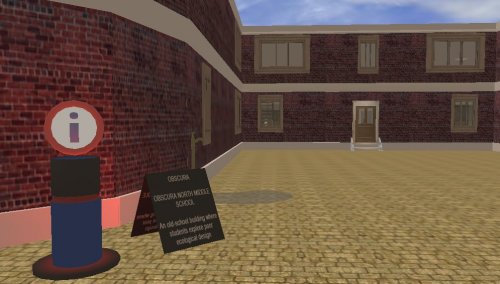
I know when I am in a strange place, being a tourist, I head for the big blue “P” signs to park and the big blue “i” signs as they usually mean INFORMATION, so I set about designing an “information post – or iPost for short”. It took 3 goes until I got one that I was relatively happy with, hence iPost3.0. They are made up of 2 parts (w-iPost1.rwx and w-iPost2.rwx, with part 1 being the base that throbs with a red “notice me” beacon, and part 2 the disk with the “i” rotating gently).
Wings3D is a useful mesh sculpting tool, and I am getting good at sculpting custom geometry, and beginning to understand the structure of a rwx file, so eventually I will be able to hack (without breaking) them to add texture, light, shading and other attributes.
DJ gave me a list of itinerary points she wanted to feature, so I set about setting out a trail of iPosts. It became apparent that each iPost would need some form of annotation so the tourists could nav and learn as they were going, without having to wait for a tour guide, so I included with each iPost a notice board with some simple orientation info.
The challenge was to make them visible, but not dominate the areas they sit in – they are, after all merely one way through the worlds. I hope we highlight some of the good ideas and work that has already been put into this world – a beginning in some ways, providing muct potential for young learners.
I used a mixture of teleports (instantaneously “arriving” at the destination when on another world, or where scenery gets in the way) and warps (fast forward travellators for placemarks that are within cooee of each other) and I think the mix works – warps are particularly useful for giving a sense of space, scale, direction and displacement and can be a fun ride.
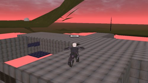
I discovered an issue that is potentially disorientating – when you teleport to part of a building, you may arrive before the building does, particularly problematic if that location is upstairs – you plummet to ground and then the building arrives around you effectively trapping you. The iPost above is the result of being bounced behind a building with the next jump taking you into it – thereby giving the world a chance to catch up with the traveler – caching the geometry as it were, pre-fetching it before you wind up trapped in it. This all depends on the net connection, bandwidth and so on, not sure i can do much more about that.
I have had a couple of guinea pig cybernauts test it out, it is a circuit – tourists can join it wherever they see an iPost. We can either leave the tourist trail in place after the event, or HIDE the iPosts until they are needed again.
Will it be successful? I have no idea – maybe the punters will tell me. Is there anybody out there?
