It’s all in the Details
Given some skill, their own space and a little time it is wonderful to see year 9 boys so engrossed in an activity (to the point that none of us heard the bell, working on into our morning tea).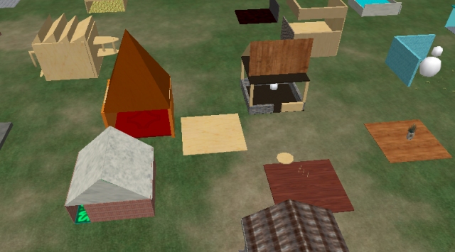 Building in the ‘Burbs
The brief was simple: Make something that looks like something, keep the scale avatar-size and make it as detailed as you have time for.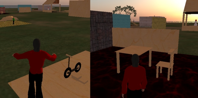
The results were, well, quite wonderful as you can see. Some went the conventional “follow the neighbour” which is quite natural in a free-form activity – creativity coalesces between near neighbours and they are surprised when you point it out to them because they are sure they are being creative and not derivative.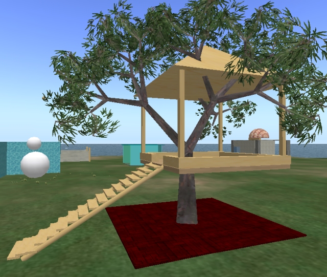
Some lovely ideas expressed, including the practicalities of access, movement and texture. It will be interesting to see how this activity changes with a pair of classes, driven by different teachers next time.
Marking Your Territory
Teaching basic building skills in an OpenSim is fairly straight forward, I have found the kids take to it fairly fast but few think through a quality build first time. Pride in workmanship comes after mastery of the tools I am hoping.
The activity was simple and open-ended – on a designated section of the continent make a slab 10m x 10m x 20cm, nestle it into the ground slightly to become your building “plot”.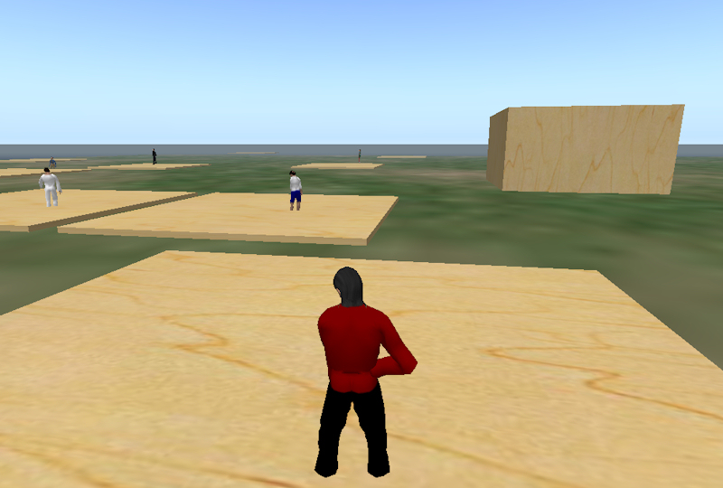
Object creation, scaling and movement skills followed texturing, exploration of other object properties and then a simple brief: make something that looks like something. the only caveat was that it needed to be on their plot, and to scale.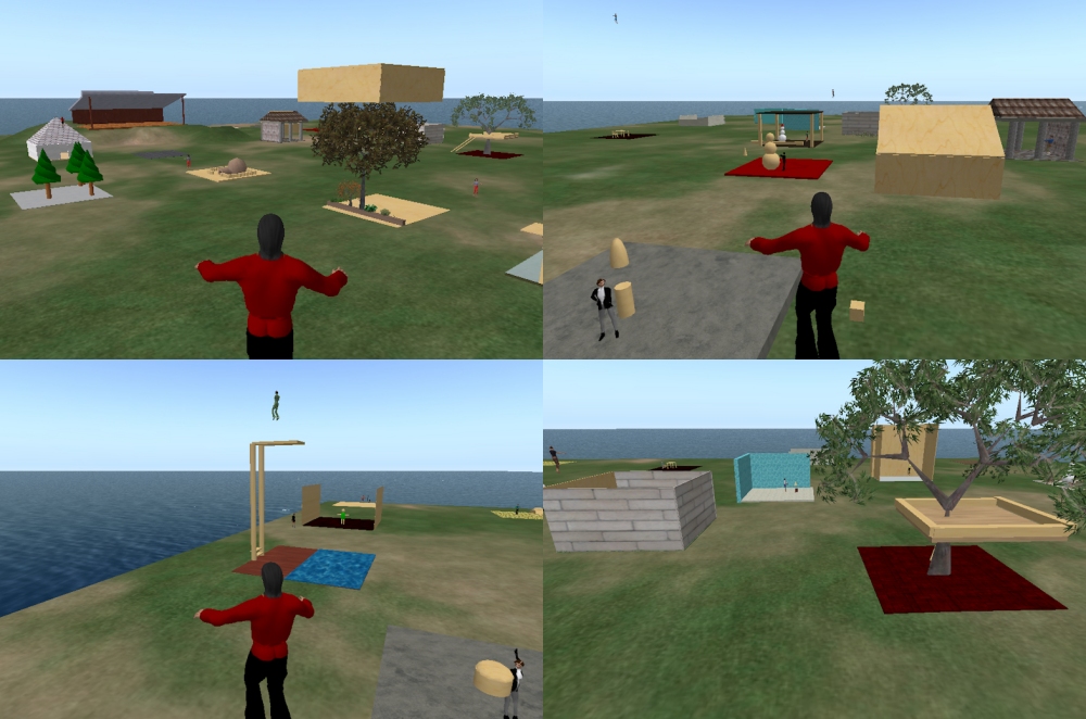
They took to the task with great enthusiasm, exploring the way you construct more complex things from primitives, scaling, rotating, moving with greater and greater precision that comes with experience.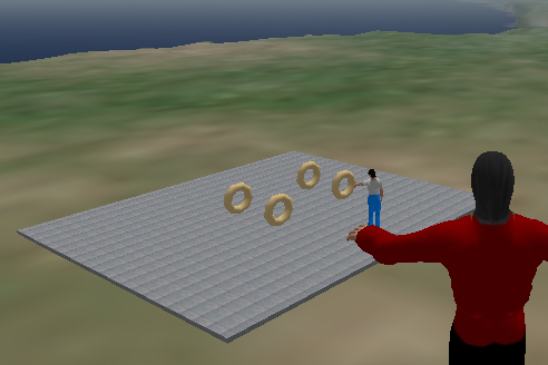
In the end they were inviting their iMates over to have a look, all fairly hoopy. We have, in the next journey into this world, to tie this world activity to the activity happening in MUD and MOO and then look objectively at the whole “amount of activity required to create a unit of believable detail”, but for now, play is a good thing.
I, Avatar
We are exploring virtual words with my year 9 students and it is a rich and varied experience, well, that is the plan at least. The worlds are textiverse (a custom MUD for them to edit), a browserverse (terraMOO, a hybrid world) and an Opensim (full 3d world called terraceLIFE).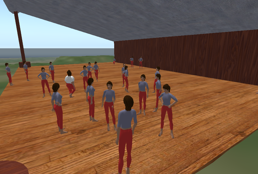
Today we ventured into terraceLIFE and explored the notion of “avatar” – the brief for the first half of the lesson was simple enough – get your avatar to look like you.
What could possibly go wrong? Year 9 boys, in an opensim, where the default avatar is RUTH, a buxom female.![]()
After some initial explanation, they took to creating a virtual presence fairly well – it is interesting to talk to them about how they see themselves – shorter than they really are, heavier than they really are, bigger nose etc. I guess it is a tall ask to do body-image stuff with year 9 boys, given the hormone storm they are currently weathering but, you know, they handled it pretty well.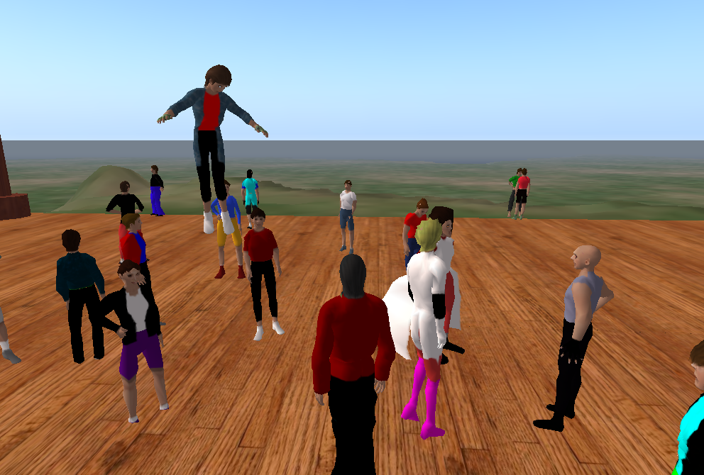
Very happy with the performance of the opensim also – 30 kids at once, all doing wonderfully interesting things, worked a charm. Next session we will explore building techniques with a simple construction project, then we will get complex and go for a collaborative building project (there will be tears before bedtime there I suspect).
I have a chunk of terrain for them to play on, will let them mark their territory and see how it goes – the only real rule here is “don’t be a dick” – it will be interesting to see how they cope.
Noob today, 1337 tomorrow …
So I have begun making a zone specifically for noobs, builder noobs in particular and it struck me how complicated building with any sort of quality actually is.
I figured I should start with a gimmick, so dived into Wings3d (a favorite mesh editor) and sculpted a HAMMER and a SPANNER – nothing says construction to me like tools. I decided they needed to be on a pedestal, rotating and glowing magically, as they do in real life. I am, initially, doing the whole “Lego” thing because nothing quite matches it as a modular metaphor, plus we are dealing with a primary clientèle so I figure I should try to talk to them where they are.
I decided that the tutorial zone should be non-linear, but if you wanted to follow the skills developmentally in a linear fashion that should be possible also – to that end I warp between stations in the order I think makes sense. WARPING is a neato transition trick that is different to teleporting – it is like a fast run to your destination – this way you still get a sense of space and a feeling like you are travelling – I think it is most effective here in the metaphor of a skills journey also.
So, in this sequence, punters click on the rotating and magically glowing toolbox to progress to the next step if they want to discover things sequentially, or walk/fly on their own. I think this is a reasonable way to do this, but am open to suggestions.
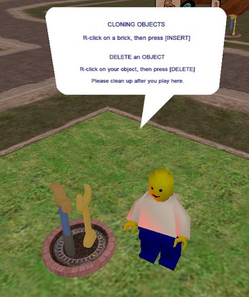
In Activeworlds, you need a source object to make a new object … this solves the age old question because you can take a chicken and make an egg, or visa versa, but first you have to CLONE an object from something already there. R-Click is the gateway to editing (including clone, delete and other stuff).
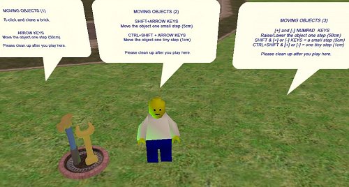
Next I figure you need to know how to move it around. Activeworlds, like Secondlife, lets you steer your object on it’s current plane using arrow keys. Key-presses equate to steps and there are three step sizes (50cm, 5cm and 1cm) achievable using raw arrows, shift+arrows and shift+control+arrow keys. raising and lowering an object is achieved using the number pad +/- buttons (step sizes and modifiers work the same) … there is an interesting rub – you NEED a number pad to be effective in Activeworlds, else you have to resort to reassigning keys that sometimes almost, kind of sort of, nearly work.
Rotating objects gets a little trickier to explain – if the object is in it’s original grid-aligned position, then controlling pitch, rotation and yaw is “relatively” straight forward – using PgUp|PgDn, Home|End and /|* buttons on the NUMBER PAD you rotate the object in x, y or z relative to the directions of the axes for that object. Rotations happen in degrees (15, 1.5 and 0.1 increments using movement modifier keys like moving) so quite precise alignment and swizzling of objects is possible. Pixel perfect is a little more tricksey as, depending on your graphics card’s ability and the client settings, some objects rezz slightly out of alignment, even tho they are not (maybe that is just me being anal, but that erks me – one particular panel in a hallway I tweak every time I walk past it … but I digress).
I am not sure how well my instructions make sense to kids who are still in the concrete operational stage (and are yet to gain the ability to envisage things in 3d), still I guess concise facts are a good thing. I had “Michael12” (a strolling year6 of no fixed address) try them out for me in-world and he said it was cool, so I guess that means it was almost non-gibberish.
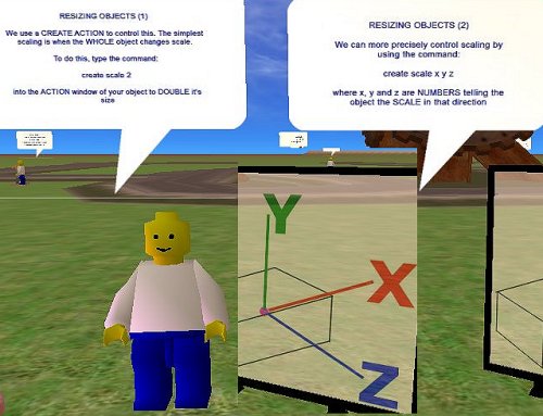
Re-sizing objects, like rotating requires a little 3d spatial awareness and I am not at all sure what I am saying makes any sense, yet. I need to mull over this – I think something diagrammatic might work better.
In all, the beginnings of the sculpture park are promising, I think they need little stages and backdrops, so will make them in keeping with the welcome wall I think as it is a simple yet effective way of creating a private space in an otherwise open world – that and the rust goes well with my sculpture so it is all visually continuous.
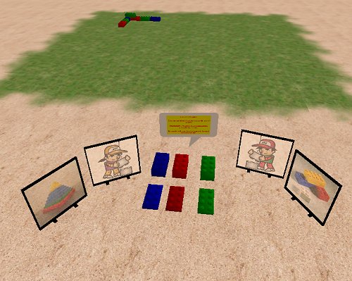
So … to test how well Cybernauts get the whole basic building block thing, I have created a stacking competition – using iLego, we are going to collaboratively build a pyramid. the bricks stack neatly side by side in whole steps, are 60cm high so stacking them on top of an existing row is manageable … we shall see how it goes. I guess this is one way to measure success.
Old school …
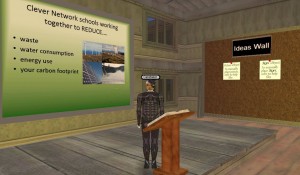
…so I am building this old style school building, right, and it is supposed to showcase all that is wrong with a non-eco-friendly establishment. So I have leaking plumbing, over flowing rubbish bins (oh, remind me to make an incinerator), blazing incandescent bulbs, inefficient aircon and so on, and some classrooms and collaborative spaces to discover and explore related issues.
Yee gods it is interesting how the design emerges from the components.
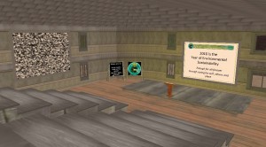
I have a two-story building and decided that one of the wings lent itself to a lecture theater (timber bleachers, bible-bashing lectern and display surfaces) and so set about kitting it out. From a purely practical perspective I am really happy with the results.
I get a presentation area, break out zone as a mezzanine above and an entrance foyer that we can use to showcase topic, speaker, resources etc. Some interesting level changes, some useful nooks and crannies and, strangely, it is just like I imagined it.
This building is teaching me all sorts of things about builds that I think I had to learn for myself. Ceilings are not the same as floors – we use “flats” to achieve both, but most flats are one sided (oddly, they have a texture on one side and appear not to be there on the other so you have to upend them to do the other job. I have a building with plenums or “ceiling cavities” when laminating a floor above with it’s ceiling below – if this makes sense, and this lets me consider other modular building techniques – each flat has scale that fit with wall pieces, so you can tile seamlessly and create quite elaborate floor plans fairly quickly with only micro adjustments (and occasional stretching) to hide the seams. Doorways and ends of walls look better if they finish in a thicker beam (as zero width walls when you look at them edge on are just plain odd), irregular geometry is a pain, and requires careful planning. Some wall sections control the tiling of textures so, although you can select a texture to match another section, the two may be tiles differently causing frustrating differences in appearance. This is really different to worlds like SecondLife where you have absolute control of texture tiling and just a lot more than frustrating to be honest.
I must be getting tetchy, but I cannot leave stuff that does not look “quite right”, so will tweak and upload variations of objects and textures so they look right – I guess it is quality control (and not just being anal), but I think the quality of the final build is worth the extra effort.
