Bright Spark…
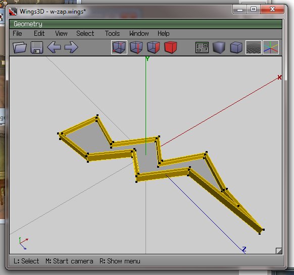
…now the cybernauts are investigating energy at the moment, or more importantly what it is and why that is important. It bridges to types of energy and sustainability and so on. My lagged brain came up with the notion of a “bright spark” as energy-related, so fired up trusty old Wings3D to make one.
I then edited the RWX file exported and changed the RGB lighting, and added a little less OPACITY, meaning by changing a number from 100 to 70, the object rezzes in-world partially transparent, which is sort of cool.
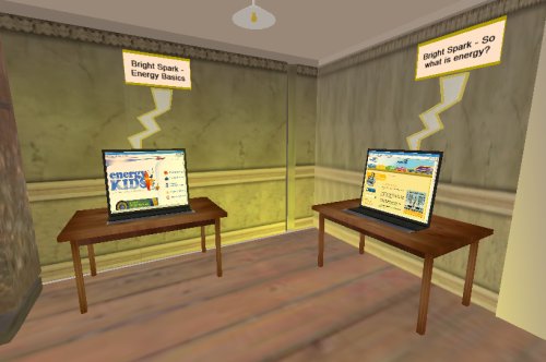
Information stations were then established containing links to websites, learning objects etc:
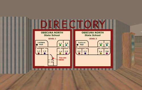
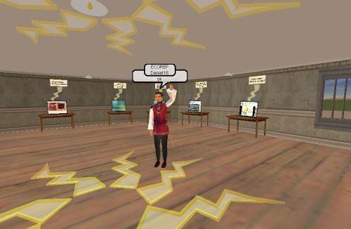
…and a little mood lighting above and it seems to work. I used classrooms 1.1 and 1.2, ground floor.
I have another 4 classrooms on this level to do the investigation into renewable and non-renewable energy. I think the location is ideal – adjacent to the eco-theatre, downstairs from discussion rooms and so on – all in all this building seems to be working out rather nicely.
So with a little decoration (can you see how the zappy things are a little bit see-through? This is the opacity of the model and I am guessing this is much less resource intensive as a way of gaining transparency than masking, which requires an initial surface and another surface modifying it) and the “Bright Spark” gallery is largely ready to go. Tried to add some “contribute your ideas” activities to the “click on stuff to find out about it” else I suspect this activity would have been better done as a web page.
…which brings up an interesting question – does being in the “world” add to the activity, or would a website be just as effective at engaging and immersing? Does this level of immersion matter at the ages our cybernauts are in, or does it provide a new level of distraction for kids who cannot multi-task at the best of times, or even single task at the worst of times?
How green is my …
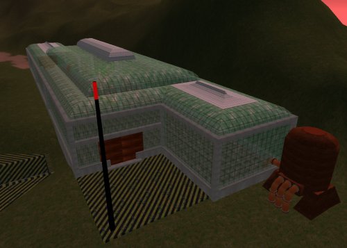
…so we are going to embed resources and activities about atmospheric science, and green house gas emissions, naturally I thought the most logical place to do this was inside a greenhouse.
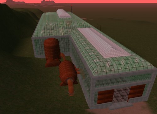
I had a plateau set aside for this building, nestled nicely in the southern ranges on SciPrime. Rather than just build a rectangular thing, I decided on a few protuberances and sexy roof line, and I used a primitive texture (the default build texture as it happens is sort of greeny griddy stuff) with some transparency masking to give the illusion of reinforced glass panels (well, it looks like that to me at least).
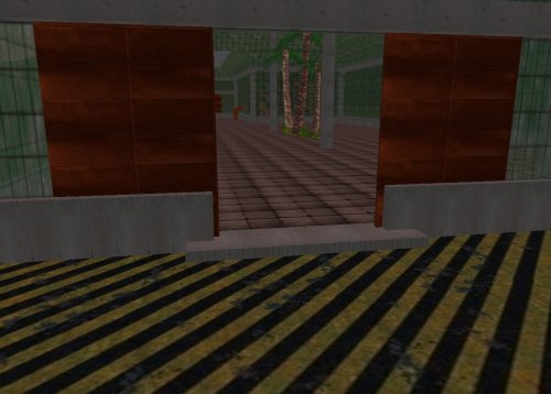
I remembered a scripting trick that let me do nice rusting (the sciprime predominant theme is rust, just in case you are wondering) sliding doors – you click one, they both open because you tell each of them about each other. After lab-rat testing with some in-world cybernauts, it appears they need to stay open for about 10 seconds before automatically shutting – that seems to work as a reasonable time to get through for even noobs.
I found the sound that was used for the original star trek door opening (a sic-fi woosh) and that is the sound made as the doors slide open (well, I thought it was cute at least).
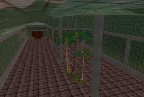
I have not yet kitted out the interior as I am still awaiting the content from our science curriculum expert, but thought some irrigation/humidity would be a nice touch, so found some “rain” that moves, and a few cycads and ferns to give a primordial tropical feel – have yet to add garden beds, organic matter etc. but we will subdivide this space into a few project/display rooms.
You _may_ be able to see the tanks and pipes – completest me has devised a water and nutrient recyc system, tank farm and engine plant – I do not think the extra effort is wasted, I aim for reasonable (or at least partly believable architecture)
So we now have an upper terrace occupied by the atmospheric research centre, the terrace below will house the “Collaboratory”, the terrace below that will house the soon-to-be-relocated non-eco school. Underground this mountain range here is the science bunker, so we are beginning to get a science-themed compound. Quite happy with the progress – amazing what can be done in the wee hours of the night.
Clothing hacking …
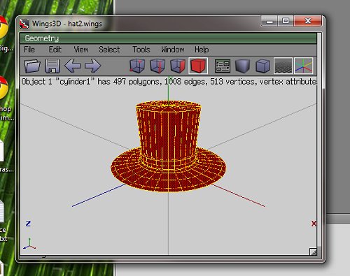
…so when you make something in Wings3D, the geometry forms a VERTEX (or 3d point) cloud. It’s solidity is comprised of polygons that are the result of the correct sequence of this “join the dots” to make FACETS that can then have visual properties of colour, texture, specularity, reflectivity, opacity and so on applied to them.
When you choose tools in wings to “color” each facet, it modifies the UV mapping of that facet when rendered in-world but the light model used by default (and no, for the life of me I cannot find how to change this) is a little odd – any colour you choose in wings is really, really light in-world (black looks light grey, blood red comes out light pink and so on). Wings has EXPORT as RWX, fortunately which is luck as RWX and COB are the two supported object definition formats Activewords seems to use.
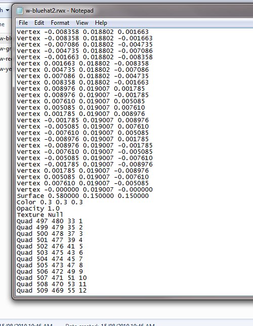
The resultant RWX (object/model definition file) contains the locations of each vertex in x-y-z terms, relative to the centre point of the cartesian plane (0,0,0) where the object was sculpted, and the order these points are joined to make a polygon mesh [you will notice I have opened up the object file in notepad – geometry purists argue you do not need anything else than notepad to make objects – they are out of touch nerds who need to get a life in my opinion 😛 ]
Fortunately, after breaking a bunch of RWX’s, I have stumbled across (yee gods, why does no one document this junk in a way HUMANS can read) a tweak – you can effect the overall colour and opacity of the model by defining the overall luminance – I have found 0.3 0.3 0.3 (for RGB) seems to work pretty well for most colours (except for yellow which comes out muddy and brown).
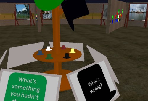
With some tweaking, my DeBono Hats finally look like they should:
These “player controlled” movers are worn – by clicking on them, users stick them to the heads of their avatars and they look quite cute (in a top-hatty sort of way). Punters, through their avatars adopt a DeBono thinking mode, and then you walk over and reflect on an issue using that mode – you can see in the background some kids have already started doing just that.
It is nice when an idea finally coalesces into the shape you wanted it to be (or is it just me being anal and doggedly plugging away at an unimportant detail until I am happy with it?) – prolly a little of column A, little from column B.
iPost 3.0
… now there is this big eLearning showcasey thing next week for EQ people but I will not be there because I am not, well, really an EQ person (Hi if you are a delegate reading this, I am speaking to you from the past … how weird is that?).
The Learning Place wants to showcase some of the aspects of MyWorld that already exist – a golden opportunity to show some of what has been done already, as a stepping stone to what can be done in the future…
… so it got me thinking what sort of symbolism is naturally “tourist-focussed”.
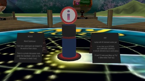
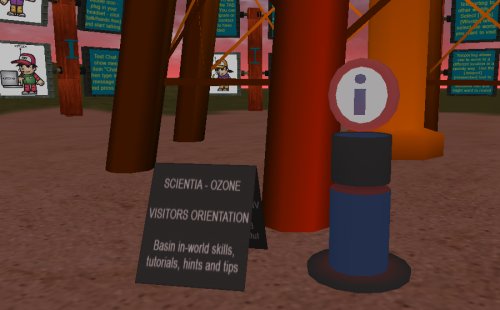
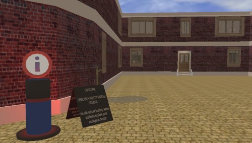
I know when I am in a strange place, being a tourist, I head for the big blue “P” signs to park and the big blue “i” signs as they usually mean INFORMATION, so I set about designing an “information post – or iPost for short”. It took 3 goes until I got one that I was relatively happy with, hence iPost3.0. They are made up of 2 parts (w-iPost1.rwx and w-iPost2.rwx, with part 1 being the base that throbs with a red “notice me” beacon, and part 2 the disk with the “i” rotating gently).
Wings3D is a useful mesh sculpting tool, and I am getting good at sculpting custom geometry, and beginning to understand the structure of a rwx file, so eventually I will be able to hack (without breaking) them to add texture, light, shading and other attributes.
DJ gave me a list of itinerary points she wanted to feature, so I set about setting out a trail of iPosts. It became apparent that each iPost would need some form of annotation so the tourists could nav and learn as they were going, without having to wait for a tour guide, so I included with each iPost a notice board with some simple orientation info.
The challenge was to make them visible, but not dominate the areas they sit in – they are, after all merely one way through the worlds. I hope we highlight some of the good ideas and work that has already been put into this world – a beginning in some ways, providing muct potential for young learners.
I used a mixture of teleports (instantaneously “arriving” at the destination when on another world, or where scenery gets in the way) and warps (fast forward travellators for placemarks that are within cooee of each other) and I think the mix works – warps are particularly useful for giving a sense of space, scale, direction and displacement and can be a fun ride.
I discovered an issue that is potentially disorientating – when you teleport to part of a building, you may arrive before the building does, particularly problematic if that location is upstairs – you plummet to ground and then the building arrives around you effectively trapping you. The iPost above is the result of being bounced behind a building with the next jump taking you into it – thereby giving the world a chance to catch up with the traveler – caching the geometry as it were, pre-fetching it before you wind up trapped in it. This all depends on the net connection, bandwidth and so on, not sure i can do much more about that.
I have had a couple of guinea pig cybernauts test it out, it is a circuit – tourists can join it wherever they see an iPost. We can either leave the tourist trail in place after the event, or HIDE the iPosts until they are needed again.
Will it be successful? I have no idea – maybe the punters will tell me. Is there anybody out there?
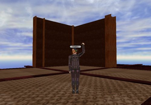
Up Up and Away … to Sky City
Now this idea occurred to me after a cybernaut (thanks Mitchell) sheepishly took me to a place where he thought other cybernauts had done something naughty – let me explain.
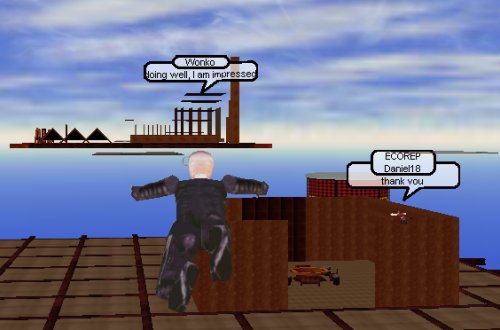
When you clone an object from one that already exists (the first step in Activeworld building), you get to choose the n-s, w-e and the up-down-ness of the newly created clone. Someone had discovered that on the construction planet (Obscura) you could change the up-nicity of an object to 500m or so (waaaay above viewing distance which is typically maxed out at 200m). What makes this neat is they then FLEW up and made a lego raft at that altitude. Far from being naughty, I thought it was brilliant, and an idea well worth expanding.
It got me thinking, that maybe our budding builders need a more realistic challenge (or maybe lego is sooo yesterday man), so came upon an idea for a building challenge.
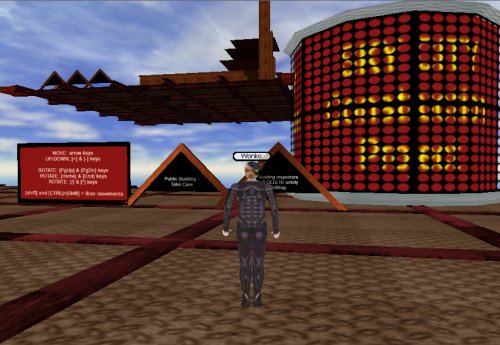
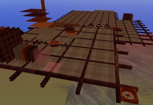
So I rigged a rusting girder platform, on some “suspensors” some 4oom above our pyramid zone (the lego building zone for noobies), lay down modular flooring, signage and some simple rules and regs, then assembled a collection of components (the lego pieces – shhhh, don’t tell them it is the same thing) they could use to make buildings in a custom “object dock” flying a little above the platform and I think I am on to a good idea.
By giving then carefully chosen objects that fit together seamlessly, and some simple construction instructions, punters clone and place their creations on the expanding platform. They are high enough to have conversation and not flood the ground with it, but the space is sufficiently detached from the main building academy (at least vertically) to be private enough for them to think they are being independent.
I chose modular scenery, walls etc that were humanoid scale – so when the build rooms and corridors they feel right. I may offer specialist building workshops at altitude – we shall have to wait to gauge the interest but it is certain that we have some interested little people with time on their hands that they are willing to spend in-world, so why not harness some of that creativity.
I also learned something about saved object groups that will be very useful. Once I had made the object bay, complete, I saved that to my hard drive (complete) so I can clone them wherever I want – they maintain their altitude information so I can be on the ground and make one appear some 400m above me almost instantly – pretty neat I think.
Is this going to result in great architecture? I do not know – it will be interesting to find out however. What do you think are the pluses and minuses of this approach – should there be city by-laws, construction codes or is that just complicating things way to much?
POSTSCRIPT:
Some kids just needed encouragement – they are doing wonderful stuff when given a little advice and some personal freedom, I can only be impressed
