Short-Beaked Echidna

There are only a few origami figures I MUST have in my collection – Steven Casey’s “Echidna” is one of these:

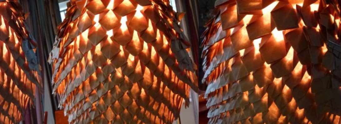
This adorable little monotreme is covered in one of my favourite square-grid tessellations, but skillfully crafted to allow all the other body bits to be where they need to.

I bought the British Origami Society booklet describing how to fold this treasure as soon as I knew it existed, and have folded it a few times now. Some sequences are nightmare fuel – this one is just so enjoyable to fold.

I recently received a shipment of paper from Origami-shop.com and in it was a 65cm 11 colour pack of the NEW Shadow Thai paper. I last bought it in 40cm square form but it was THICK so to my delight this version is thinner and takes complex folds really nicely. I chose this fur-like colour because it most closely matched the quill and hair colour of an echidna.

Continue reading

1152: Platypus

Browsing a Korean Origami Convention book (the 6th – 2015), as you do, I stumbled across a Platypus I had not seen before:

Designed by Fernando Gilgado, this genius design uses duo paper to isolate the beak, tail and legs from the body in a really interesting way.

After some simple pre-creasing, you collapse to a base that looks really useful for all sorts of long critters with head/tail and 2 pairs of legs (like a crocodile, say)

Continue reading

1147: Zippy Car

Counter culture I love little zippy cars:

Our current car is old, but a lovely tiny Mitsubishi Colt (that looks a LOT like this model), and … eventually … we will need to replace it but, annoyingly Mitsubishi only make HUGE battleships now – not everyone wants a battleship!!!

Continue reading

1145: Nova Kusudama

I am often given 6″ origami paper by well-intentioned friends who know I do origami and assume 6″ paper is useful to me. I have lots of it – and I mostly use it to fold kusudama:

I had a pile of duo Tuttle watermelon/lime duo paper, so resolved to treat it to make it more interesting. I bought some acrylic inks a while back, and a mouth airbrush, so decided to tone the pages while learning how the airbrush works – a fun experiment.

I chose to spatter the watermelon side with white ink, and the lime side got yellow and black spatters. The effect is quite lovely and delicate – it compliments the geometry of the model really well.

I had seen a youtube tutorial of Kovács Vincéné’s “Nova” kusudama, and I thought the geometry really interesting. Like many spikey balls, 30 units in 5/3 clusters makes a nice little structure.

Continue reading

1144: Gilmore Davidson’s Platypus

It is a well known fact that Australians MADE up the illogical collection of animal parts we then called a Platypus:

Ducks bill, fur, poisonous spines, webbed feet, lays eggs, feeds young milk, lives under water … LOL … then only people silly enough to believe this are tourists, right?

One of many benefits of networking at an origami conference is that you get to mix in the real world with talented designers – if you are lucky they share their designs with you.

Continue reading

1141: Matthew Dunstan’s Dragon

Looking at my “must fold when time” pile, I remembered a diagram destoned for a Peter Buchan-Symons “Folding Fantasy” book:

This lovely duo colour dragon is designed by Matthew Dunstan, and is an interesting variation of a classic birdbase with some grafts for the head.

An intense little fold in places (the head in particular is really fiddly and thick), I really like this little western dragon with good proportions and a unique character.

I folded this from a 35cm square of Duo Kraft paper – a mistake in retrospect, it would have been easier (less finger bruising) with a larger thinner sheet. Originally I planned to fold it with my Shadow Thai, but I think it is too thick … now I know how the fold works I may still give that a go.

EDIT:

Folded with a 40cm square of origami-shop Duo Thai paper, with some extra detail and shaping, this little beauty is a treasure indeed

1137: Crane in a Box

Cruising the channels on Origami Dan, I found a CP for a fold challenge I had missed, but decided to give it a whirl anyways:

Designed by Scott Okamura, this seemingly impossible fold featured a traditional Tsuru (crane) folded in the middle of a large page of duo paper – the surrounding paper is then formed into a box.

Continue reading

1135: Steven Casey’s Seamless Chessboard

Colour-change models are astonishing to me, designing models that use colour change are something special:

I have folded a number of different models like this, nothing quite like it however – what sets this model apart form any other is that each “tile” on the board is a seamless square.

Folding this from a SINGLE UNCUT square ends up being a bit of a brain-fuck. The paper was blue one side, white the other (actually cheap and nasty 70cm wrapping paper from my local dollar store). Distributing the “colour” is achieved, mostly, by bringing the sheet edges up through pleat bundles using a variety of techniques.

You can see the final location of the 4 corners of the original sheet in this development photo:

Planning/designing of a model like this is beyond me – pre-preparing the colour changes means that every bit of the paper has a job – either visible “tile”, spacer, flipper, mover etc to get the bits of colour to get where they need to go. Fold accuracy is the make or break of such designs – novices who use a “near enough is good enough” approach will not succeed here.

I was asked to test fold this, by Steven Casey, prior to publication. The diagrammed sequence is intense, starting with a 40×40 grid. Most of the folding is working on the wrong side, creating interacting pleat stacks that sit flat but that strategically manipulation pleat order. The run towards the “checkerboard” effect happens around the edges first, they they are migrated further towards the centre (although really only in a 4-unit strip around the periphery.

Continue reading

1129: Blastoff!

Grommit, you forgot the crackers!!!

Scrolling through this year’s JOISEL AWARD entrants, I noticed a lovely little Rocketship designed and folded by Zhu Yandan, from China – it was released with a crease pattern (CP) so I thought it worth a try.

I used a technique called “Ghost Creasing”, where ONLY the needed creases are transferred via careful embossing using a stylus. This eliminates the excess grid creases, making the fold cleaner.

Continue reading

1127: Bin Chicken

The majestic “Bin Chicken” is, sadly, an aussie icon – those black-headed ibis emerge from the deepest, moistest corners of a ripe dumpster, dripping bin juice.

Yes, I KNOW that an Egret is not an IBIS (the beak is different and the body colouration is different… but… creative license). This is Jeong Jae Il’s “Egret” – a beautifully lifelike rendition of an altogether more polite bird. The diagrams, from “Potential Origami” suggest heavier paper, so I trotted out a lovely 58cm square of duo Yukogami to work this model.

The paper is stark white one side, jet black the other, heavily textured and light cardboard in thicknicty, but I thought I would fold until either it was finished or it failed. The only real struggle was thinning down the legs that end up being about 12-18 layers. In finishing, after dry-shaping, I slid a little white glue inbetween the layers then re-formed on my dry shaped form, compressed and found the paper dried solid – an added bonus was I did not need to add wire, she stood on her own!!

Continue reading

1112: Binding Cube

One of many things I like about being a subscriber of JOAS’ Tanteidan Magazine, is the little modulars that usually start each edition. Leafing through #191, I spotted a series of cubes designed by Jun Maekawa:

My pick of the cubes is his “Binding Cube”, a delicious little 6-piece modular whose layers lock so completely and tidily, the cube looks like it is one piece.

Folded from 3 squares of Tuttle duo each split into 2:1 rectangles. The module is relatively simply folded from thirds, the lock has layers of adjacent modules interleaving in such a clever way. Some of the modules were hard to place because the lock has very little clearance if folded accurately.

I like this model a lot, and am also happy with the colour choice.

1106: PBS Scorpion

One of the benefits of working as part of the editing team on an origami book is that you get to see models before they are in the wild:

This is my test fold of Peter Bucan-Symons new “Scorpion”, a delicious model with a fun challenging fold sequence.

I folded this from a 60cm square of black/natural duo kraft paper (some of my dwindling stock of Ikea duo – WHY won’t they stock this anymore????).

Continue reading

1092: Riccardo Foschi’s “Frog/Toad”

Few origami designers design, present and then release CPs, diagrams and tutorials for their work like Riccardo Foschi:

When I saw his newly designed frog 2 days ago, I was hoping for there to be a tutorial or CO soon, his tutorial dropped yesterday and I knew I had to fold it.

I used a square of Duo Thai paper – dark and lime green and folded it slowly to enjoy the demonstrated process.

The front end of this frog/toad is wonderful – big whimsical eyes, beautiful suckered feet, nice shaped head. My only criticism is that the back legs and bum are a little stubby – there is quite a bit of paper back there that is not doing a lot, but as is it is simplistic. None the less, I love this little chap.

Continue reading

Solving CPs

Crease patterns, photo sequences and diagrams are the primary way of communicating the complexities and details of an origami model. While I am fairly capable of faithfully following even the most complicated diagram sequence, but still consider myself a newbie at solving CPs:

Origami-kimiro's CP

Sometimes the job is easier – lines are indicated as mountain/valley (red/blue or dashed/dot-dashed lines), other times you only get the major creases of the “base”, from which you then shape and tease the details from.

Origami-Kimiro, a Discord user on OrigamiDan released a CP for a simple domino toppling, and I knew I needed to give it a try:

my fold of Origami_kimiro's CP

Using 12″ duo Indigo Tuttle paper, I laid in the creases, oriented them in mountain/valley and marvelled as the paper collapsed into a base that was pretty close to done. Finishing the hand, colour changing to get the coat sleeve, posing and done.

Continue reading

1077: 王翌宸’s WALL-E

I remember doing a test fold of this delightful model nearly a year back, but never got around to blogging about it… so I grabbed a trusty 50cm square of yellow/brown Origami-shop Sandwich paper and got gridding:

Wall-e – author unknown

With just a 16 grid and some strategically placed diagonals, and a breathtaking “all at once” collapse, the general morphology of the model sorts itself out pretty quickly.

Finessing the details and pose are fun and fairly straight-forward, and before long the character of this simple but adorable little trash compactor begins to emanate from the otherwise inanimate paper from whence it sprang. I do not however know the author of this work – I only have diagrams with the author in Chinese (王翌宸) – thank you, whoever you are for such a stunning design.

Continue reading