1117: Mod on a Moped

When you talk of “box pleating”, the young kids in the origami design sphere seem to think they invented it. I was fishing around on the web, for origami-related things as you do, and stumbled across an astonishing scanned page from Neal Elias’ notebook from 1968 that features box pleating:

This is Neal’s “Boy on a motor scooter” – an amazing proto-design from 1968!!!!! (this is all there is, you have to fill in the gaps – it was his personal notebook, the diagrams were all HE needed to fold the model) but what an historical gem of a design. It is doubly interesting because it was designed 3 years before I began my journey in origami as a wide-eyed, clueless 11 year old.

Further research suggests this page was “ripped” from a BOS Publication Booklet 35 (still in print?) called “Neal Elias Miscellaneous Folds – II “, edited by Dave Venables. I have purchased the previous Neal Elias volume but was unaware this treasure exists – it has prototypes of some very famous and completely revolutionary designs indeed (like “The Last Waltz”).

Back in the “early” days of western origami, Elias was a pioneer, realising that by gridding a sheet of paper, then using gridlines and 45 degree connectors you could pleat astonishingly complex structures that could then be shaped into complex figurative models. As a kid, the few models I had access to from him were like crack to me. I mastered the “Elias stretch” (these days I think they call it a ‘pythagorean stretch’) and “Elias base”, making skiers and knights in armor, all from squares.

Many of his designs use odd shaped paper – this model uses an 8×22 grid, and the colour change base is particularly wonderful, leaving all the bits of a person in one colour and a lovely long pleat bundle of alternate colour emerging from him. I can see so much potential of all sorts of things here.

Continue reading
1115: Typeface

Determined to fold something, I came across some diagrams in Origami Dan (an origami-focussed Discord) and figured I would give it a go:

Base unit

The idea behind the the fold is interesting – making, from a square, a 3×4 matrix of “pixels” that can be colour changed either whole or in part. From this base you then strategically reveal colour to form letters of a typeface.

Designed by Jason Ku, it is a clever and flexible shape and I then set out to form all the letters of the alphabet and digits of basic numbers.

Some of the letters represented more challenge than others – some had little fiddly 1/4 triangle components, others had reverses contrary to the underlying structure, requiring some strategic swivels and reverses. the more observant among you will realise I stuffed up the colour conventions and got a few letters in reverse colours to the others (I, J and L for those that did not notice) – meh.

The most time-consuming part of this fold was compiling the photo record and stitching it together – happy I managed it however.

1100: Steven Casey’s “Clownfish”

I have the privilege of being asked, from time to time, to test fold origamists new models. Steven Casey (designer of the BEST origami echidna there is) asked me to test his new design for a clownfish, naturally I jumped at the chance:

I took a 6″ square of regular origami paper (orange on one side, white on the other) and, armed with disbelief that this was the suggested paper size, began folding.

My fold approach over the years has changed markedly – I fold until either (1) I get to the end or (2) it fails, and I learn something. I FULLY expected this to go wrong – my fat clumsy fingers do not normally fold those small squares of origami paper people keep giving me (with every good intention), and for LOTS of this model I resorted to my favourite set of bent-nose tweezers just to keep it sharp (and not mush with said fat clumsy fingers).

It became pretty apparent early on that the fold sequence was entirely achievable with 6″ (15cm) squares, resulting in a charming little totally recognizable nemo. I made a few cosmetic suggestions to the diagram set (sometimes the designer lets me edit their diagram directly) and repeated the fold on 17cm square – I liked the smaller one better but it was prolly because I rushed the second fold while paying attention to the telly instead. I would like the head/gills to lock on to the body a little more and the fins also to stay together, but these are minor unimportant quibbles.

I am hoping Steven is planning a book of his new designs, this one is lovely and reminds us all that “you just gotta keep swimming”.

1080: Invention of the Crane

This is a very personal fold, as well as a lovely meta design:

Boice Wong's "Invention of the Crane"

The first thing most people learn when they start out in Origami is the traditional crane. This fold speculates the genesis of this model as a happenstance some time back in the mists of time. Interestingly, the first model I was taught, as an 11 year old, by a Japanese exchange student, was the crane.

Designed by Boice Wong, released as a crease pattern, I was decided to give it a whirl. If I am honest, I am not really happy with my first fold, and will probably attempt it again (having learned heaps in the folding). The CP can be found here: https://www.obb.design/cp#iocrane

Using a single square, no cuts, we have a lady in a traditional kimono, kneeling in front of a low table on which there is a single crane. The genius of this design is the model is complete – it looks finished all the way around (indeed I fashioned a lovely “bow” Obe at her back. There is a colour change making the table/crane a different colour to the girl (I decided the focus of this fold was the crane, so it ended up white – next time I might just paint it, or perform an additional colour change which is possible with this design but results in a clumsier crane I think).

Boice Wong's "Invention of the Crane" Views

This has taken me an age. Initially, I attempted to collapse the base only to discover it was inside-out, then trying to sort out what flaps did what job (kinda aided by sorta advice from Boice himself), and decided on the current flap assignment when trying to ascertain how to compose the kimono and hide the internal layers, yet still give me the hair fringe. Quite a wrestle in the end.

Continue reading

1059: Riccardo Foschi’s “Gnome on the shelf”

One of many benefits of being a member of Origami USA (OUSA) has been the “Origami Connect” online classes program. For Christmas, members were treated to a free workshop with Riccardo Foschi, who taught his delightful “Sitting Gnome”:

Riccardo Foschi's Gnome on the shelf - folding along with OUSA

Due to the tyranny of international timezones, their 1pm EST workshop meant I had to join them 15 hours later (for me, 4am the day after). It feels weird to be in their future, but there you go. I set an alarm, made a cup of tea, folded along then attempted to go back to sleep again afterwards (fairly unsuccessfully, annoyingly).

Riccardo Foschi's Gnome on the shelf

This model is a lovely figurative representation of a gnome – hat, nose, moustache, beard, stubby body and stickey outey legs and feet – a little like the “elf on the shelf” idea – it is a pity he has no hands (I might mess with the design a little as there is LOTS of paper not doing very much that I may be able to encourage some arms from).

Riccardo was a delight, his models have a real cuteness charm, and he is very generous sharing CPs with the community, many of which I have folded, I love his design sense, and the fun his models are to fold – often cartoonish happy things they are.

Continue reading

The Last Dogfight

A group of mates has, periodically over the last few decades, gotten together in a smoke-filled room to play a board game. Not any old game, but “Dogfight” – a dice-based, card controlled WW1 battle of the airspace over Europe.

Although most of the players were well passed their fifties, we squabbled like little kids, goaded each other fearlessly, preened and peacocked at our prowess and got nit-picky about the many nuances of rule variations hard won.

dogfight battle - endgame

It was honestly some of the best fun to be had, and the chaps were good sports, one and all. In January, one of our quartet passed away. “Dr Winston O’Boogie” (Michael) flew off into the sunset for the last time to great fanfare.

A quintuple ace in training

We have met since, dragging a young buck into the fold, and played until Michael’s house (the home of our epic aerial battles) was finally sold.

Tonight is our last hurrah!

Marc Kirshembaum's Biplane and Eduardo Clement's Avioneta

I have struggled to find a suitable way to celebrate such a wonderful partnership, but turned to Origami, as is my want. I wanted to fold BIPLANES for the original pilots, and a smaller plane for the new recruit, and have really struggled with these models. The Biplanes are designed by Marc Kirschenbaum. I wanted to fold them smaller but failed many times, only being able to manage them from 60cm squares (and not very tidily sadly) – red, naturally in honour of Von Richtoffen (or Snoopy, take your pick).

The smaller plane is “Avioneta” designed by Eduardo Clemente – a charming little fokker.

I hope the guys like them. I remain forever grateful for the opportunity to act like little kids when surrounded by the wonder and majesty of imagination, fun and friendship. Chocks away Chuck, fly true one and all.

1052: Theremin

I am a firm believer that people learn something important when they try to do something they are not good at. I have recently bought a Theremin, and I want to pretend that I am anything but not good at playing it, but, like, it is hard to master:

Origami Theremin

I noticed that a Theremin has a distinctive shape: an upright antenna that you use to control pitch (the high-lowness of a note), and a horizontal antenna loop you use to control volume. To my (not so great) surprise, I discovered that no one had yet done an origami model for this thing, so set about having a go.

I started with the fish base, long flap for the pitch antenna, long flap for the stand, then 2 shorter flaps become the volume loop. Some accordion pleating and the basic morphology is there. You can (I hope) see the development in the sequence below:

It is a start, I might try to refine it (add knobs, refine the antennae, etc). Happy with v1.

1050: Kunsulu’s Music Stand

When I saw the folded form I thought there must be some trickery here:

Kunsulu's Music Stand

All I had access to is the crease pattern (CP) for this model, and, given I am trying to develop my CP solving skills I thought it fair game to give it a try.

Kunsulu's music stand development

Based on a 16×16 grid, some strategic box pleating and an ingenious colour change we have a classic music stand, 3 shapely legs and a piece of sheet music that is a different colour to the stand – magic.

Kunsulu's music stand views

I like this model a lot – it just sort of coalesced in to a successful model for me, although the first fold was on paper that was same both sides but I could see the potential for colour change and had to fold it in duo paper,

1045: Miyuki Kawamura’s “Gear Cube”

On a high from a folding session taught by Sipho Mabona, I wandered virtually out into the virtual conference meeting rooms and sat in on a modular folding session, where I was taught the modules for a “Gear Cube” – 6 modules that make an intriguing structure:

Miyuki Kawamura's Gear Cube

This is designed by Miyuki Kawamura, and I came in half way through an informal folding session, but picked it up fairly quickly.

I will probably fold this again, with bi-colour paper (all the same however) as I suspect the “gear” mechanism might look more interesting if they are all the same colour.

Apparently spontaneous folding sessions are a feature of Origami conferences – I have never been to one so I was delighted that people shared skills at all hours of the day and night – the Zoom/chatroom combination facilitated by “Gathertown” was fabulous.

1044: Geisha

I attended the 2021 April OUSA Foldfest – a 25 hour online marathon of folding tutorials, lectures and virtual meet nd greet:

Sipho Mabona's Geisha

One of 2 deciding reasons to attend was the opportunity to be taught a model by Sipho Mabona – his “Geisha”.

At 3am, I awoke, made tea, cut some paper ready for the workshop (international time is cruel), and, thankfully followed alone a complex but beautiful sequence.

By pure coincidence, my paper looked like Sipho’s, and my final model is really close (amazing for a first fold, testament to the sequence and expert tutelage).

Continue reading

1037: Beth Johnson’s Horse

Madly, I agreed to participate in an international tournament, at the Intermediate level:

Beth Johnson's Horse

Intermediate meant you got a diagram and 72 hours to fold a rendition of it. I decided the “advanced” category was beyond my available time as you only got a CP and presumably relied on the power of prayer.

I gave it a whirl, went for crisp and accurate, but played a little with the flowing style of mane. It was loved by nearly noone who voted – fair enough. Other, less well folded versions (in my opinion) got more “likes” – social media is like that. Useful punch in the face, thanks.

Round 1 of the tournament done … and I am eliminated. Time to focus on more important things.

Continue reading

1012: Cluster

If one word sums up 2020, it has to be “cluster”. Sadly, in the Covi-19 era, we find at the centre of most clusters is a cluster-f*ck:

Xander Perrott's "Trillian"

In desperate need of a fold, I turned to Xander Perrott’s e-book “Folded Forms” that I bought a while ago and settled on “Trillian” – a glorious 30 unit modular cluster that looks a little like a flower ball.

Continue reading

1001: “Have the Lambs Stopped Screaming, Clarice?”

I have been a fan of the Hannibal Lecter thing since that was possible. Books, movies, series, love it all, but few things are more chilling than the original “Silence of the Lambs” movie. One of the central images of that movie, and a delicious cover art of the original book features the Deaths-head Hawkwing Moth (Acherontia atropos):

This model, designed and shared by Sebastian Limet, requires thin bi-colour paper. I had some duo paper that was strangely thick, but managed to work the design and surface the details that make this mode so striking.

Deaths-head Hawkwing Moth

Folded from a 40cm square of black/white duo unryu, I have enjoyed following a fold sequence that started at the Waterbomb base and goes sideways from there.

Concentrating on the important details here – wings, skull, abdomen and antennae, this relatively simple model is all style, genius design typical of the brilliance of Sebl designs.

Continue reading

992: Venom Kusudama

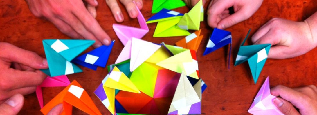
For the last 10 or so years, I have used Origami as a pastoral care group “getting to know you” exercise, encouraging the students in my care to get involved, learn something new, and share the skills.

The WHOLE is greater than the SUM OF THE PARTS.

I laminated red and black paper, then sliced it up into 2:3 ratio rectangles. I taught some kids, they taught others – together we made the 30 modules necessary to make this spikey ball (a stellated icosahedron).

Venom Kusudama

The modular construction is an interesting exercise in 3 and 5, and because the paper is quite rigid, the resultant kusudma is lovely – it joins a nice collection of similar of collaboratively constructed modulars – a testament to the power of the idea, the value of being open to new things and the willingness to have a go.

979: Lion

Folding feline shapes is hard work, making them look realistic is harder. This is the first of a series of Lion studies, designed by Lionel Albertino from his book “Safari Origami”:

lion

Colour management here is lovely – folded from natural/black Ikea Kraft, hiding away the black except for the mane and tip of tail is hard work. When I close up the seams and pose it he will be tidier, but “folds only” it is a stable, self-standing model.

Continue reading