1123: Anubis

I have always been fascinated by Egyptian symbology, myths and ancient artforms. The very pictorial style is angular, stylised, often animal-based and very interesting. Anubis is the god of funerary rites, protector of graves, and guide to the underworld, in ancient Egyptian religion, usually depicted as a canine or a man with a canine head:

I am currently watching STARGATE, a few episodes at a time with my son. I began watching it back in the days of free-to-air broadcasting but, for whatever reason I stopped (prolly because I had a life and no longer had time/access to episodes). The series premise is interesting, and I particularly love their hijacking of Egyptian gods/mythos as the “baddies”, as well as the whole aesthetic.

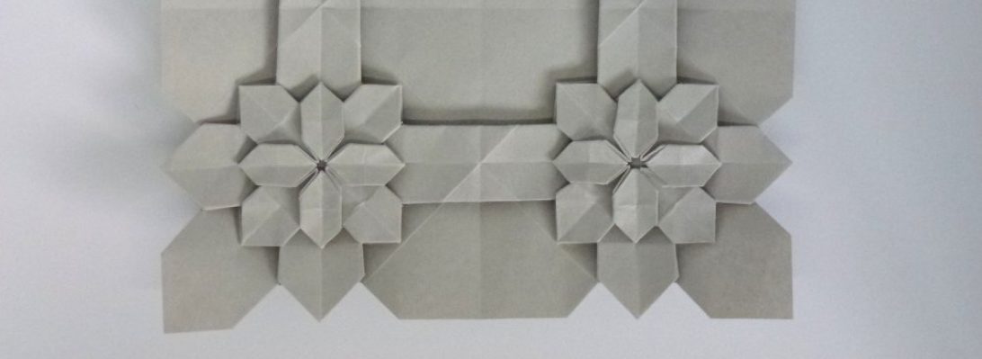
I wish I could remember where I first found this Crease pattern (CP). It has been in my “must try this, sometime” pile for a couple of years and I finally got around to it when looking for something to fold with my second bit of treated Wenzhou rice paper (not made of rice, is a fine and resilient mulberry). I also wish I knew the designer – can anyone help me out here as I would love to give proper attribution?

The CP seemed pretty straight forward – indeed the collapse was quite natural (I did not do my usual “parachuting” as I tried to collapse key details in the order that seemed most logical), and resulted in a base with a myriad of stickey-outey parts in more or less correct locations. I am so pleased with my developing CP solving skills – a loooooong way to go, but every success encourages me further.

Continue reading

1122: Pearl Anniversary

30 years ago, the Papermakers & Artists of Queensland (POQ) first formed – in July it was their PEARL anniversary.

As a diverse collective of artists (that allowed me to become a member) we were asked to respond to the notion of “Pearl” to assemble an exhibit of artworks to mark this occasion.

My thoughts, naturally, turned to folding and I was reminded of an organic 3D form I last explored for “The Offering” inspired by the work by legend Paul Jackson.

The idea was simple – using one set of slightly overlapping pleats in one direction, that are then corrugated in the perpendicular direction, you can “tease” dimensionality by “cheating” the overlap with a delicate pull.

Taking a square of trusty Kraft paper, I mocked up a Maquette, pleating and corrugating around a central line, then “MacGyvered” a hinge using simple box-pleating techniques, as I had the notion it should be a “book” of sorts. The hinge mechanism had a natural gutter that allowed me to bind pages securely inside also.

For the production fold, I chose metallicized pearlescent “Terryfoil”, I cut 2x 25cm squares and pleated and corrugated, carefully, then spread the pleats until it achieved the desired curvaceousness.

Continue reading

1121: Santa/Satan

Comes the time of year when we tell little kids that a morbidly obese stranger in a red suit breaks into their house (by coming down a chimney or other entry point if there is no chimney), eats some random snack, feeds a portion of that snack to a reindeer (who has a birthmark on it’s nose) and then leaves presents, regardless of whether you have been an entitled little shit all year, or a saint:

As a parent I was complicit in this lie until my kids (fairly early on) cottoned on to the fact that this whole thing was so very unlikely, and merely a mechanism for justifying a mound of presents under the xmas tree.

I wanted to try out the new paper pack of Satogami I got from Origami-shop and this festive fold seemed like the perfect opportunity given the latest Tanteidan magazine (which contains it’s diagrams) arrived this week also.

Duo Satogami is quite thick. I bought a paper pack of 58cm squares, mixed colours and love the vibrancy of the red/white, and also love the texture of the paper. I _want_ to report that pre-creasing Satogami was easy … but … I really struggled to my the reference folds and to fold accurately because of the thickness and texture. The paper reverses fairly poorly also (meaning I had to correct lots of folds for accuracy as I went to ensure alignment of layers and edges during more complex moves.

Continue reading

1120: Steven Casey’s “Numbat”

Occasionally I am privileged to be asked to test-fold new models, and I jumped at the chance to fold this Numbat:

As far as I can see, this is the first depiction of this native Australian insectivorous marsupial in origami and the design captures the morpohology and proportions really well.

Starting with a preliminary base, then folding a skewed birdbase, the side stripes naturally emerge in cleverly controlled colour changes, along with the legs, neck and ant-eater-like snout, along with a lovely bushy tail.

I folded this chap from a 40cm square of white/natural Kraft paper (some of my last from the Ikea stash – I wish they sold it again, great stuff) and the fold sequence was fun – some really interesting moves and a good range of skills necessary to complete the model neatly.

Continue reading

1119: Pocket Godzilla

Leafing through one of the origami books I helped edit, I came across a cutey little “Godzila”esque model I had not folded:

Designed by Oriol Esteve, from his book “Fold with the Flow”, this charming little Chibimonster seems ready to terrorise Tokyo and dodge nukes as the ineffectual army fights back.

I used to watch monster movies with a passion, and the old “guy in a rubber suit” versions were terrifying as a kid, but the whole Godzilla franchise seems to go on and on with re-imaginings and various levels of tech in the VFX often getting in the way of the story, at least these days.

I had a 25cm square of blue metallic paper (I think from a sample pack from Origami-shop) that was light blue on the reverse, so decided to torture it into shape. The book suggests Kami, and thinner paper would have made some of the moves less thick, but I think I like him chunky. It is a fun design, starting with one of Oriol’s much-used bases. I like that both the eyes and the back spikes are colour changed. The proportions are nice and I also like that he free-stands because the centre of gravity has been considered in his pose.

1118: Riccardo Foschi’s “Human Bust”

I virtually attended OWM4 (Origami World Marathon 4) recently – one of the classes I attended in the wee hours of the morning was a workshop run by Riccardo Foschi:

Riccardo has a recognisable style and his models are a delight to fold (you will find lots of them in this blog). This stylised human bust has such a serene expression on their face, I knew I wanted to try it.

My fold live in the workshop was ok, but re-visiting it when I had some more time (and better understood the fold) resulted in a nicer overall model.

I had recently purchased some “Shadow Thai” paper from Origami-shop.com and thought it would be a good fit for this model.

I chose a grey/smoke blue sheet (black on the reverse, it is a duo paper) and figured because it is a little thicker that it would help with the statuesque quality of the design.

Continue reading

1115: Typeface

Determined to fold something, I came across some diagrams in Origami Dan (an origami-focussed Discord) and figured I would give it a go:

Base unit

The idea behind the the fold is interesting – making, from a square, a 3×4 matrix of “pixels” that can be colour changed either whole or in part. From this base you then strategically reveal colour to form letters of a typeface.

Designed by Jason Ku, it is a clever and flexible shape and I then set out to form all the letters of the alphabet and digits of basic numbers.

Some of the letters represented more challenge than others – some had little fiddly 1/4 triangle components, others had reverses contrary to the underlying structure, requiring some strategic swivels and reverses. the more observant among you will realise I stuffed up the colour conventions and got a few letters in reverse colours to the others (I, J and L for those that did not notice) – meh.

The most time-consuming part of this fold was compiling the photo record and stitching it together – happy I managed it however.

1113: Shore Crab

When tidying my JOAS Tanteidan Magazines, I discovered a special edition that members used to get – one issue in particular has 2 terrifyingly complicated models I have not (to my surprise) ever tried:

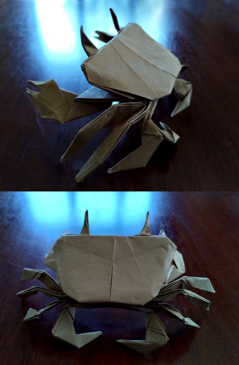
This is Hideo Komatsu’s glorious “Shore Crab”, an amazing but intense design that is described in a fascinating sequence of diagrams. They are involved, number 194, and involved many advanced techniques, and in retrospect I probably looked at it at the time I got it and mentally added it to my “try later” pile.

I started with a 50cm square of crispy Kraft, and adopted my usual fold it until it either fails or finishes.

To my delight, the logical sequence and time to be accurate and careful resulted in a clean fold which I absolutely love. The resultant crab is plucky, has bulk (indeed, most of the paper is folded inside) and is just so anatomically crabby.

It takes great skill to design a model that closely resembles the silhouette of a figurative subject. It takes a special sort of genius in design to ensure that the model looks like the subject all the way around – the underside has all the features of a crab also – just brilliant.

I made a little clear acrylic stand that snugly slots into the crab’s carapace, enabling it to stand up like it is either walking or challenging and, I added some tiny spots of glue to keep seams from gaping all that was necessary to present the fold.

Continue reading

1111: Goldfish

Cleaning my desk is an important psychological activity, it helps me “move on” and, oddly, I had not cleaned my home desk since well before I retired … I am not sure why, but I just was not ready:

The cleaning process also de-clutters, re-homes and generates a pile of detritus headed for the rubbish bin. Among the accumulated layers of life I discovered a printed diagram from Pham Hoang Tuan for a lovely ornate goldfish.

I remember being sent a bunch of printed diagrams with a paper pack from him (I won it for … something I cannot remember), and realise I have yet to fold most of that hand-made and hand-coloured paper … must do something about it.

I approached this model like most – I first grabbed my goto test-fold paper (Kraft), decided to try a 30cm square and set of, reasoning that I will either finish it or fail trying – both are useful journeys.

Like many diagrams from Pham Hoang Tuan, I found some inconsistencies between what was being asked and what you had to do that with, but as a reasonably experienced folder I was able to “creatively” step over those weirdnesses.

This model is lovely, and screams for pretty, textured, thin paper – so I must re-visit it with the same. Like Ronald Koh’s Goldfish, this model is volumetric (it is chubby), has a profusion of fins and the shaping requires a deft, delicate touch. I love the formation of the eyes and separation of the fins, a symphony of bizarre genetic engineering designed to create fan-tailed delicate ornamental goldfish.

It contains a number of seemingly impossible closed-sinks to shape the body and create volume, but the net result is quite beautiful – one I will return to.

1109: Bảo Long’s Spider

Nothing makes you feel old like stumbling across a delicious, simple new design from an 11 year old:

This is Bảo Long’s design, which appeared on one of the Fakebook groups I am a member of (https://www.facebook.com/groups/366246184054415). I am amazed this did not exist before as the separation of legs and abdomen/cephalothorax is so natural.

Folded from a 20cm square of Tuttle indigo duo paper, lovely sequence, terrific and pretty quick also.

EDIT: I just noticed it only has 6 legs (pretty sure I can find more), I guess 11yolds cannot count these days 😛

1107: WALL-E

Although (technically) a re-fold, the last time I attempted to fold this I had a partial crease pattern and a broken incomplete set of instructions in Russian, and just muddled along. I am not sure the resultant model even looked like Wall-E, but I was happy to sort of nut out a scheme for making his tracks.

I stumbled across a set of partial diagrams by “Tosummerny” in Chinese that seemed to surface more of the actual process, so decided I had to have another go.

I went big – 90cm square – seems excessive …but … I have another exhibition pending and thought this might make a good display piece if it ended up tidy enough.

The diagrams clarify the construction of the pleats necessary to form the main body, and how they cleanly articulate to make the beautifully treaded tracks, and also simplified what I had in my previous attempt mangled together to form the eyes.

Continue reading

1105: En Garde

It is a wonderful thing when designers share their processes, crease patterns and diagrams. Boice Wong is one that readily shares the CPs of his amazing designs, and when I saw “Sword and Shield V2”, I knew I had to give it a go:

Although I have been folding for decades, most of what i have folded has been from DIAGRAMS (step by step folding guides). By far the MAJORITY of origami out there does not exist as diagrams, but a larger proportion exist as CPs (crease patterns). I have been, over the last few years, working on my crease pattern solving skills.

This model is based on Boice’s 24 grid CP, and the collapse is relatively straight forward. Sometimes CPs give you crease orientations (red=mountain, blue=valley), sometimes not. The skill comes with deciding which creases to impose first as part of the collapse. Sometimes it does not matter, most it does, some you can derive based on “knock on effects” on one crease that causes the orientation of a sequence of subsequent creases. Sometimes it is pure witchcraft.

Continue reading

1104: BE the Water

For the last few years, over what was the Christmas holiday school holidays, I have gone lap swimming at a 50m pool near(ish) me. I always intended to continue into the year, but work and lane availability (due to squad training) at the times I could go always got in my way:

Having recently retired, I have been able to continue right into winter (the pool is indoor, it is heated) at a time that suits me, and choose to do it as one of my activities on Wednesdays. It is part of a broader activity set that is hopefully keeping me fitter and a little less fatter.

I first saw this lovely, simple, perfect design on Joseph Wu’s Facebook feed. It is a rare privilege to have one of Joseph’s designs shared step by step, and knew it was something I HAD to fold. It perfectly captures that delicate balance between clawing through the water, and drowning. The model is taking a breath on the left-hand side. This is something I struggle to do due to neck vertebrae fusion (for some reason right-hand breathing is easier). Swimming is a gentle exercise that is gradually giving me back some of the movement lost since the neck re-build.

I folded the model from a piece of Tuttle indigo dye duo paper that has a pattern that closely resembles the ever-changing abstract water caustics I swim through every time I get in the pool. I love the simplicity but also the accurate depiction of that, a very human act of swimming.

1103: Brian Chan’s “Walking Locust”

This model has been on my “must fold” for ages, but I had only ever seen a CP and could never make head nor tail of the design. I saw a rendition on Origami Dan Discord and, after an enquiry it turns out there exists an unofficial diagram, drawn by Hua Ge that guides folders through this terrific insect:

I split a sheet from a new 60cm roll of medium weight Kraft and began folding. There is a load of pre-creasing, primarily setting up the high-density collapses to make the long thin legs, so accuracy early on pays dividends later.

Uncharacteristically, this model uses loos pleat structures to bulk out the body, define the wing covers and head/thorax/abdomen, with a deliciously complex un-sink to make the head-thorax join. Interestingly this model also has a super-detailed head/face – it reminds me so much of the hoppers in “A bugs life”, and it has real “cute” personality, as much as a locust can be cute.

Continue reading

1100: Steven Casey’s “Clownfish”

I have the privilege of being asked, from time to time, to test fold origamists new models. Steven Casey (designer of the BEST origami echidna there is) asked me to test his new design for a clownfish, naturally I jumped at the chance:

I took a 6″ square of regular origami paper (orange on one side, white on the other) and, armed with disbelief that this was the suggested paper size, began folding.

My fold approach over the years has changed markedly – I fold until either (1) I get to the end or (2) it fails, and I learn something. I FULLY expected this to go wrong – my fat clumsy fingers do not normally fold those small squares of origami paper people keep giving me (with every good intention), and for LOTS of this model I resorted to my favourite set of bent-nose tweezers just to keep it sharp (and not mush with said fat clumsy fingers).

It became pretty apparent early on that the fold sequence was entirely achievable with 6″ (15cm) squares, resulting in a charming little totally recognizable nemo. I made a few cosmetic suggestions to the diagram set (sometimes the designer lets me edit their diagram directly) and repeated the fold on 17cm square – I liked the smaller one better but it was prolly because I rushed the second fold while paying attention to the telly instead. I would like the head/gills to lock on to the body a little more and the fins also to stay together, but these are minor unimportant quibbles.

I am hoping Steven is planning a book of his new designs, this one is lovely and reminds us all that “you just gotta keep swimming”.