1129: Blastoff!

Grommit, you forgot the crackers!!!

Scrolling through this year’s JOISEL AWARD entrants, I noticed a lovely little Rocketship designed and folded by Zhu Yandan, from China – it was released with a crease pattern (CP) so I thought it worth a try.

I used a technique called “Ghost Creasing”, where ONLY the needed creases are transferred via careful embossing using a stylus. This eliminates the excess grid creases, making the fold cleaner.

Continue reading

1128: Origami Computer

For a system to be considered “Turing Complete”, it must be able to be used for completing any computational problem. In the world of DIGITAL Turing Complete setups, these computations are achieved using simpler binary operations (like NOT, AND, OR, NOR, etc.).

In a paper recently released by Mathematicians Thomas C. Hull and Inna Zakharevich, they propose flat-foldable crease patterns for origami “processors” that simulate a number of simple binary operations (namely NAND, NOR, AND, OR, NOT and a few ancillary operations) making the theoretical proposition that flat foldable origami is Turing Complete.

I folded a few of the paper’s logic gates, and made a video of how they work – have a look:

Although this is a little nerdy, I can at least conceptualise the idea that a network of interconnected origami processors could, theoretically, actually do something useful. Technical challenges exist with having such crease patterns co-exist on the same sheet, in sufficient quantities to represent anything other than single bits (0/1 or On/Off or True/False), but the idea is none the less tantalising.

I link to a copy of the paper here: FLAT ORIGAMI IS TURING COMPLETE

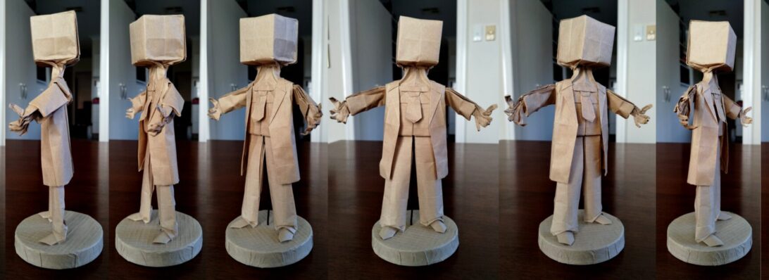
Barnaby Blockhead

Everyone called Charlie Brown “Blockhead”, a past Deputy Prime Minister continually is caught acting like one, so I began wondering what that would might like:

I had recently folded Boice Wong‘s astonishing pair of figures called “Emptyhead” (I named them Dumb and Dumber), so started there, and re-familiarised myself with the crease pattern, devising a smoother collapse (as I adopted the much criticised method of “parachuting” the last time).

I briefly toyed with the idea of posing him like Neo during Matrix’s groundbreaking “bullet time” scene, but decided to go simpler because he would be a … simple … soul.

The tricky bit was to use minimal paper for a neck, leaving enough of a pleat tube to sculpt a 2×2 solid cube, and explored that geometry a bit before settling on a scheme.

Continue reading

Cat, Rat, Cheese

I had forgotten how wonderful it was to lose yourself in a fold, particularly an Eric Joisel design:

I decided it was time to re-fold Joisel’s Cat because … the last time I attempted it back in 2011 (as part of the original 365 project) she turned out barely recognisable:

Naturally, the cat is looking at something, I decided it must be a rat. There are few more character-ful designs than Joisel’s Rat, so I folded him again – this time on a sheet 1/4 the size of the cat (to sort of get the scale right).

I reasoned the rat was around for a reason, so quickly found Jeremy Shafer’s “Cheese” design and decided the rat’s next meal would be cheese (unless he himself did not become dinner for the prowling cat). I folded the cheese with a square 1/4 the size of the rat to sort of get the scale right.

All too often a fold is completed in isolation – few designers design “sets” of models that are sort of meant to go together. Joisel’s Cat and Rat reference each other in their diagrammed sequences – I like that. Both models have challenging sequences – each with places where your judgment on where a fold goes completely changes the attitude of the model – I like that also as it let’s you infuse character into the model, and often means subsequent folds look different.

I think the only other origami artist that comes to mind for designing “scenes” is David Brill – his masterpiece “Brilliant Origami” is full of fun tableaus.

1127: Bin Chicken

The majestic “Bin Chicken” is, sadly, an aussie icon – those black-headed ibis emerge from the deepest, moistest corners of a ripe dumpster, dripping bin juice.

Yes, I KNOW that an Egret is not an IBIS (the beak is different and the body colouration is different… but… creative license). This is Jeong Jae Il’s “Egret” – a beautifully lifelike rendition of an altogether more polite bird. The diagrams, from “Potential Origami” suggest heavier paper, so I trotted out a lovely 58cm square of duo Yukogami to work this model.

The paper is stark white one side, jet black the other, heavily textured and light cardboard in thicknicty, but I thought I would fold until either it was finished or it failed. The only real struggle was thinning down the legs that end up being about 12-18 layers. In finishing, after dry-shaping, I slid a little white glue inbetween the layers then re-formed on my dry shaped form, compressed and found the paper dried solid – an added bonus was I did not need to add wire, she stood on her own!!

Continue reading

1126: Matt LaBoone’s “Chinese Dragon”

Matt shared a 2015 design on Fakebook recently, so I decided that given it is nearly Chinese New YEar, and it is a “Year of the Dragon”, folding a dragon I had not yet attempted was a good idea:

This dragon, in structure, is similar to Kamiya’s Ryujin 1.2 (in sheet layout at least), but does some interesting things with the body and tail that were fun to fold.

Initially I tried it with a sheet of Yukogami, and abandoned it before I managed to get to the base because it was just too thick. I resorted to a nice crispy thin 55cm square of Kraft (I should have test folded it first anyways – doh!).

I added a wire armature and did a swirly pose, raised a front foot and had the opposite foot mid-step, it is a little cute.

Chinese dragons differ from the Western tradition by not needing wings to fly – they are way more “serpentine” as opposed to scaley bird or scary bat.

1125: Botticelli’s “Birth of Venus”

After acquiring a copy of “Potential Origami” by top Korean Origami designers, I was struck with a choice – which astonishing model should I try first:

It is well known that i love a bit of classical art, and am fond of a fullsome bosom, so decided on Han Ji Woo’s astonishing design based on Boticelli’s painting masterpiece.

I started with a 90cm square of kraft, and intended to give this a try, fully expecting it to fail. My approach to designs outside my skill range is to “fold until it fails or is finished”. I have used this mantra for decades and, as was the case this time around, I discover I have “levelled up” in terms of skills.

The design here is genius. Although it is a boxpleated model, the allocation of flaps to details and proportion evident, as well as attention to the original artwork is outstanding.

From a single sheet of paper, we have a naked lady, masking her modesty with hands and a wicked hairdo. She is standing on an open scallop shell, because … well … that is how she as a Roman Goddess was apparently born. Clearly a little more is now known about where babies come from but it is a striking model version of Botticelli’s classic painting.

I want to tell you this model came easily, and that the shaping was intuitive, but … it wasn’t. I suck at shaping, so really feel like i have levelled up on this model – making the body luscious (yes, I know the breasts are a little “cubist”, but ample and pointed in the right direction. I am particularly happy with the much layered and frizzed hair.

Continue reading

“Hydrangea Quilt”

I _may_ have mentioned I am a member of Papermakers and Artists of Queensland (PAQ). I was approached to contribute to a soon to be mounted gallery exhibition entitled “All Stitched Up”.

I had no intention of contributing because … I don’t stitch, and integral to each work needed to be stitching.

Stitch Artist Fee Garrett-Benson approached me and encouraged me to get involved, suggesting a collaboration. After some to and fro of ideas, a “quilt” made up of separate origami elements stitched together was settled upon.

I love Shuzo Fujimoto’s “Hydrangea”, so decided to echo the Crochet squares my Mum used to make into blankets and fold 12 squares (4×3) to suggest a quilt.

Dear friend Janet brought back many glorious papers from her trip to Japan recently, and I remembered a particularly stunning sheet of gold dry-brushed red Kozo which I figured would be perfect. I managed to cut 12 21cm squares from the sheet with nearly nothing left (which was pleasing) and set about folding hydrangea units.

Tentatively I handed them (and some Kraft maquettes) to Fee, we talked threads. Initially I thought gold thread until Fee showed me some luscious red silk thread that was nearly the same colour as the paper and the decision was easy.

After experimenting with typed of stitch and stitch placement on the Kraft maquettes, Fee decided on lovely loose loops to join the quilt units together.

The result is wonderful. I framed the quilt and the WIP experiments in Perspex sandwich frames (from Ikea) and am quite chuffed with the result.

The production fold and WIP bound for PAQ “All Stitched Up” exhibition, soon to be on display at the Gympie Regional Gallery 22 Feb – 23 Mar 2024.

1124: Vase Algorithm

I recently opted in to a “fold along” workshop (at 1am-3am local time) with Gerardo at neorigami.com and a number of guest demonstrators. The first model was a square “Vase” designed by Saburo Kase:

The process, starting with a “preliminary base” got me thinking about generalization of the algorithm to other regular polygons. The corner treatment is radially symmetrical (ie. you do the same thing on each corner), and has 3 “about here” judgement folds that all combine to control the final shape of the vessel …. so….

I cut an equilateral triangle, a new square and a regular hexagon, then formed “preliminary bases” from each geometry.

Next, I followed the corner algorithm on each of the 3, 4 and 6 corners respectively to see how it behaved. I now regret not also using a regular pentagon, as I think it would possibly be a “sweet spot” for the organic shaping … maybe some other time.

Continue reading

Lunar

Fueled up and having an extra sheet of tissue from the shirts I bought yesterday, I set about being more deliberate in my crumpling.

First up I scrunched the sheet up tightly and randomly, then flattened it – I regret not doing this on the previous square field crumple as it helps refine the end texture I found.

Next, I chose random bits of crockery of different radii, placed them in an aesthetic grouping and then gently eased the paper around the different circumferences (to mark the circles is all). I then removed the china, flipped the sheet and set about HARD creasing the circles.

Next, I gathered all the sharp circle creases together, encouraging the remaining tissue back, away from my gathered edges. I did the same for the smaller circles and brought them together with the large circle edges, then hard crumpled everything (like seriously squished it) back away from the circle edges.

Continue reading

Square Field Crumple

I bought some new shirts yesterday – interleaved inside was some lovely white tissue. I folded it into 3rds, then half to get a square, then half, then half and kept going until I had a small, multi-layered square about 8cm on the side.

Next I crumpled that so the centre of the square was a point. It was tough as there were so many layers. I then opened the last halving, reinforced the valley between, inverted one of the points (as one was up, the other down), and re-crumpled the points.

Repeating this technique, opening a layer, reinforcing the valleys in-between each point, inverting half so they all pointed the same way and re-crumpling, allowing the crumples to become more random as they thinned out.

Continue reading

1123: Anubis

I have always been fascinated by Egyptian symbology, myths and ancient artforms. The very pictorial style is angular, stylised, often animal-based and very interesting. Anubis is the god of funerary rites, protector of graves, and guide to the underworld, in ancient Egyptian religion, usually depicted as a canine or a man with a canine head:

I am currently watching STARGATE, a few episodes at a time with my son. I began watching it back in the days of free-to-air broadcasting but, for whatever reason I stopped (prolly because I had a life and no longer had time/access to episodes). The series premise is interesting, and I particularly love their hijacking of Egyptian gods/mythos as the “baddies”, as well as the whole aesthetic.

I wish I could remember where I first found this Crease pattern (CP). It has been in my “must try this, sometime” pile for a couple of years and I finally got around to it when looking for something to fold with my second bit of treated Wenzhou rice paper (not made of rice, is a fine and resilient mulberry). I also wish I knew the designer – can anyone help me out here as I would love to give proper attribution?

The CP seemed pretty straight forward – indeed the collapse was quite natural (I did not do my usual “parachuting” as I tried to collapse key details in the order that seemed most logical), and resulted in a base with a myriad of stickey-outey parts in more or less correct locations. I am so pleased with my developing CP solving skills – a loooooong way to go, but every success encourages me further.

Continue reading

1122: Pearl Anniversary

30 years ago, the Papermakers & Artists of Queensland (POQ) first formed – in July it was their PEARL anniversary.

As a diverse collective of artists (that allowed me to become a member) we were asked to respond to the notion of “Pearl” to assemble an exhibit of artworks to mark this occasion.

My thoughts, naturally, turned to folding and I was reminded of an organic 3D form I last explored for “The Offering” inspired by the work by legend Paul Jackson.

The idea was simple – using one set of slightly overlapping pleats in one direction, that are then corrugated in the perpendicular direction, you can “tease” dimensionality by “cheating” the overlap with a delicate pull.

Taking a square of trusty Kraft paper, I mocked up a Maquette, pleating and corrugating around a central line, then “MacGyvered” a hinge using simple box-pleating techniques, as I had the notion it should be a “book” of sorts. The hinge mechanism had a natural gutter that allowed me to bind pages securely inside also.

For the production fold, I chose metallicized pearlescent “Terryfoil”, I cut 2x 25cm squares and pleated and corrugated, carefully, then spread the pleats until it achieved the desired curvaceousness.

Continue reading

1121: Santa/Satan

Comes the time of year when we tell little kids that a morbidly obese stranger in a red suit breaks into their house (by coming down a chimney or other entry point if there is no chimney), eats some random snack, feeds a portion of that snack to a reindeer (who has a birthmark on it’s nose) and then leaves presents, regardless of whether you have been an entitled little shit all year, or a saint:

As a parent I was complicit in this lie until my kids (fairly early on) cottoned on to the fact that this whole thing was so very unlikely, and merely a mechanism for justifying a mound of presents under the xmas tree.

I wanted to try out the new paper pack of Satogami I got from Origami-shop and this festive fold seemed like the perfect opportunity given the latest Tanteidan magazine (which contains it’s diagrams) arrived this week also.

Duo Satogami is quite thick. I bought a paper pack of 58cm squares, mixed colours and love the vibrancy of the red/white, and also love the texture of the paper. I _want_ to report that pre-creasing Satogami was easy … but … I really struggled to my the reference folds and to fold accurately because of the thickness and texture. The paper reverses fairly poorly also (meaning I had to correct lots of folds for accuracy as I went to ensure alignment of layers and edges during more complex moves.

Continue reading

1120: Steven Casey’s “Numbat”

Occasionally I am privileged to be asked to test-fold new models, and I jumped at the chance to fold this Numbat:

As far as I can see, this is the first depiction of this native Australian insectivorous marsupial in origami and the design captures the morpohology and proportions really well.

Starting with a preliminary base, then folding a skewed birdbase, the side stripes naturally emerge in cleverly controlled colour changes, along with the legs, neck and ant-eater-like snout, along with a lovely bushy tail.

I folded this chap from a 40cm square of white/natural Kraft paper (some of my last from the Ikea stash – I wish they sold it again, great stuff) and the fold sequence was fun – some really interesting moves and a good range of skills necessary to complete the model neatly.

Continue reading